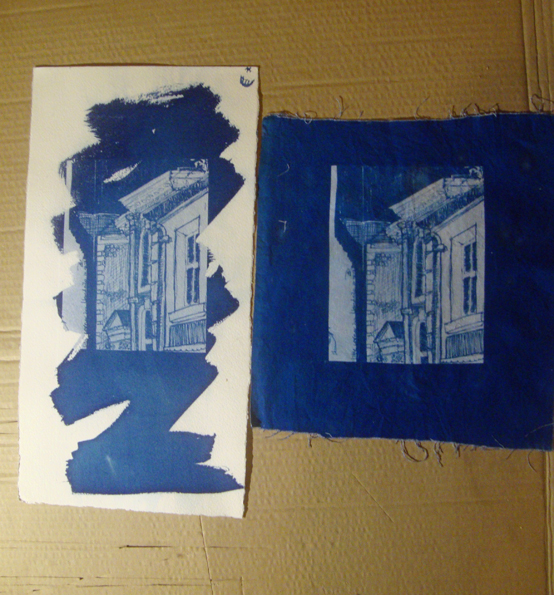
I did some experimental cyanotypes yesterday, comparing different papers and fabrics. I used some of my sketchbook drawings for the imagery. The best results were given by a medium weight white cotton that was dipped into the cyanotype chemicals and squeezed to remove the excess. There was also a good result with the white Somerset paper, applying the chemicals with a brush. The brushwork becomes a part of the overall image. The original drawing is a sketch I did in Llandeilo.
I’ll be developing some more images onto larger pieces of fabric for a new group project I’m involved with called ‘Divided By The Meltwater‘, which is a collaboration between artists in Swansea and North Devon. We face each other across the sea. At one time in the distant past, it was all dry land. Then the sea levels rose and we became separated. The project explores this concept.

Beautiful “old world” buildings! Interesting concept for your group project: separated by geographical change, reunited through art.
Yes, it’s caught the imagination. We can see each other’s coastline across the sea but it’s a 6 hour drive to get there as we have to go along the coast.
Very good and interesting to print on farbric. It looks incredible. Have a wonderful day! 😉
Thank you. I’ll be doing a lot more on fabric in the next few weeks 🙂
Ohh did you have your own chems? I just poured some away today thinking they were really old!..they were sludgy so I guessed they were! I just ordered new for my workshop at the weekend.
I used the ones at the print workshop. They looked Ok but I just got some of my own chemicals as I want to do a lot on fabric over the next few weeks. Hope the workshop goes well.