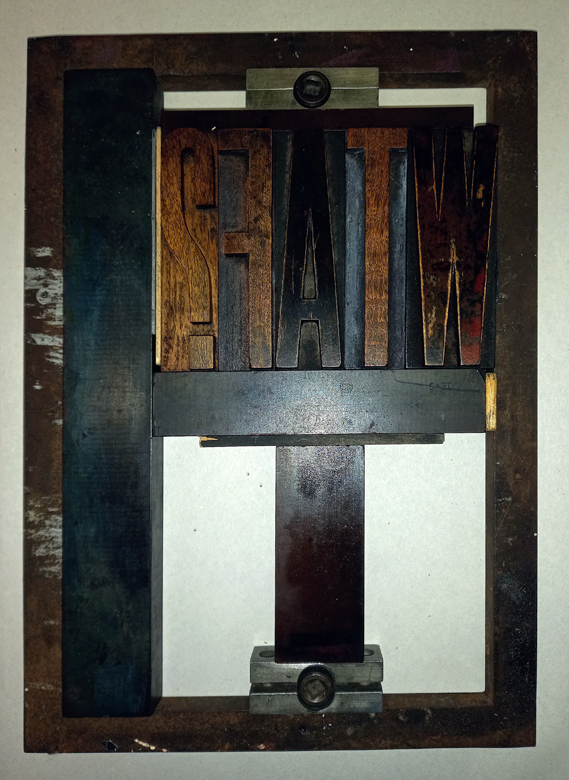
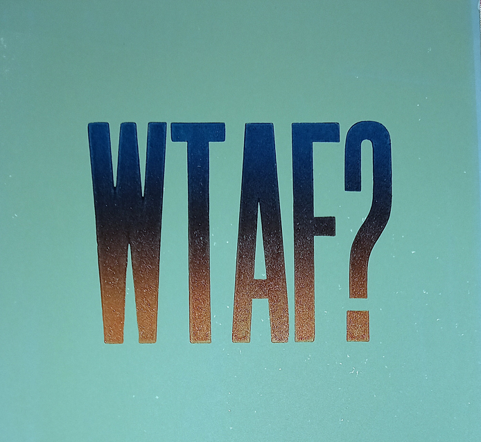
A couple of weeks ago I had a session on the Columbian Press at Swansea Print Workshop, using some antique and vintage wooden Letterpress. It didn’t work out too well, the letters were very dirty with a build up of ink and gunge over many years. I cleaned them up with vegetable oil and fine wire wool and had another go, rainbow rolling Cranfield Safewash Relief inks. Much better results – compare for yourself here.
The ink is much more even with fewer flaws. The letters are still quirky, the edges are a bit wobbly after many years of use, but the print quality is so much better now after a good clean. It’s a lesson learnt. Clean before printing as well as after.
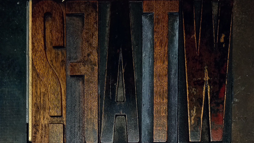
The cleaning process is gentle so while it removes the accumulated gunk of decades, it still leaves a lovely rich patina on the wood which is beautiful to look at in its own right.


A good question for our times
Isn’t it just?! I have no idea what’s going on most days 😀