Nice nibbles and a nice cat in NYC.

Ink drawing: The auctioneer at Bloomsbury, NYC.


I was at a benefit auction of prints for Manhattan Graphics Studio in Bloomsbury’s auction house, NYC. It was good fun and I was bidding for a lovely piece by Carol Wax. It was at the end of a very long and hard day at the International Print Fair and I was shattered and managed to get a seat at the front, but there was only the auctioneer in front of me so I drew him and he carried on regardless – a real pro!Very up-market nibbles here and the auction raised loads of money, but I was outbid. The drawing is in Faber Castell Pitt pens into my Tate Postcard sketchbook.

We met a lovely cat earlier in the day; the studio cat at Solo Originals gallery – a little chubby Siamese cross, very affectionate. The owner was also very nice and showed us around the studio which had genuine Bavarian litho stones still being used.

Pooped at the Printfair!

Ink sketch: Manhattan at night.


A drawing in my Tate Postcard sketchbook from my trip to NYC to see the International Print Fair a couple of years ago. We had been walking around Manhatten for days, going to exhibitions, talks and demonstrations of printmaking and we were pooped! We holed up in this very modernist cafe near the Bloomsbury Auction Rooms, where we were going to a fundraising auction for the Manhatten Graphics Studio and I drank tea and nibbled cake and did this drawing. It combines two hard things – drawing the night and drawing through reflective glass. I could have chosen something easier to draw, like the cafe interior and its customers!!!!!

However, it gave me a reason to break out my Faber Castell Pitt pen set of 6 greyscale brush tips that I hardly ever use. I enjoyed drawing it and I should do more nightime drawing, but once I’m holed up in my little house, I rarely want to go out again.

I’m A Sucker For A Flying Buttress!

Ink Drawing: Gargoyles at Saint Mary Redcliffe.

I was stuck in Bristol for a couple of hours a few months back, waiting for a train from Temple Meads station, so I went for a wander over to the magnificent Saint Mary Redcliffe church, a beautiful Gothic building started in the twelfth century and finished a couple of hundred years later. It has wonderful flying buttresses and I’m a real sucker for a flying buttress! The very first church on this site was way back in Saxon times and the present church was badly damaged when struck by lightening in 1446. During World War Two, a bombing raid hurled a large piece of tram track into the churchyard where it remains to this day, sticking out of the ground as a reminder of how near the church came to being destroyed.

Queen Elizabeth the First described it as “the fairest, goodliest, and most famous parish church in England” and it has close associations with the tragic Thomas Chatterton, the poet Samuel Taylor Coleridge and the brilliant artist William Hogarth, who painted a triptych for the church, removed in Victorian times and now stored in St. Nicholas Church in Bristol. I sat in the grounds during Evensong and made this sketch in my ‘origami’ sketchbook, using Faber Castell Pitt drawing pens. The building is festooned with magnificent medieval carvings and there is a huge amount of variation. Grotesque gargoyle heads jostle with the sculpted features of ordinary folk on windows and turrets. I only had time to draw a tiny fraction of the magnificent building but I must go back and take a look at the Gothic interior and track down the Hogarth triptych sometime.


Japanese Barens [artgeeky stuff]

Ink drawing: A demonstration of Japanese woodblock printing.

When I visited the International Print Fair in New York City a couple of years ago, I went to a demonstration of Japanese woodblock printing by the artist Takiyi Hamanake [I hope I spelled that right]. It’s a different way of printing; instead of rollering oil-based ink onto the cut block, you brush glue onto your woodcut and brush water-based pigment over that, then lay a very fine paper on top and rub it very hard with a Japanese baren.  The result is delicate, very different to printing with the old, heavy-duty Victorian Columbian press at Swansea Print Workshop. Takiyi used a modern ball-bearing baren, a type I had never seen before. I have used a traditional bamboo baren with varying results but the ball-bearing one was amazingly quick and easy to use. I’m trying to track one down but I haven’t found a British supplier – yet!

This drawing is in Faber Castell Pitt drawing pen in my little Tate Gallery postcard sketchbook. I filled it during my New York visit as a present for my husband. It was scribbled very quickly and I’m afraid it’s not a very flattering portrait of the artist!

An Elder On The New York Subway

Ink drawing: An Elder on the New York Subway.

I went to the New York International Print Fair a couple of years ago and spent the best part of a week travelling around the city to loads of print exhibitions and events. A lot of the time I was on the subway and as I always carry a sketchbook with me it gave me a great opportunity to draw people. I was staying up in East Harlem and saw this elderly man on my way back to the hostel.

The train was packed and I only had a few minutes to sketch people as you never knew when they were going to get off. He was sitting very quietly, deep in thought and concentrating on his prayer beads. A very young man was sitting next to me, looking over my shoulder as I drew. I didn’t mind, he was no bother. When I finished he flashed me a big smile and said ‘Cool’ as he got off the train. Made my day 🙂


High Speed Life Drawings

Pastels: High Speed Life Drawings.

Drawing at high speed can give us really vibrant and exciting images which are even better if they’re overlaid on the same paper. For this exercise I used A1 sugar paper and a handful of coloured chalky pastels. The model went into a sequence of 2-minute poses, five in all and I used a different colour for each pose. Some of the drawings are better than others but if I want to develop one, for example as a print, all I need is a bit of tracing paper and a conte crayon.

Speed Scribbling!

Ink thumbnail sketches.

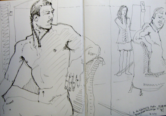
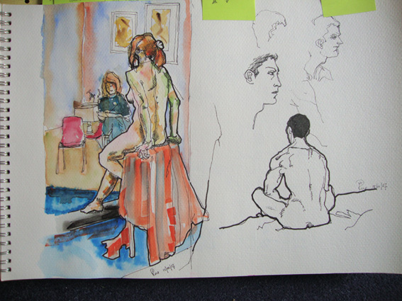
There’s always a temptation when you’re working with a model to make the most of the time you have and launch straight in to a formal detailed drawing but sometimes it pays to try out some quick scribbles first, putting the models in a variety of poses and making some very small, scribbled sketches. A lot of classical artists worked this way, doing thumbnail sketches and when they decided on the composition they liked, they drew a line around it to mark it out as the one they’d develop.

I worked with an older male model for these thumbnails and he’s drawn in Faber Castell Pitt pen onto Bockingford paper. The sketches are only a few inches high and were done in minutes but it’s surprising how much detail you can cram in when you’re not concentrating too hard and it encourages very loose and free mark-making which gives the work a lively, dynamic feel to it.


A Monumental Man

Chalk and charcoal drawing: male nude.

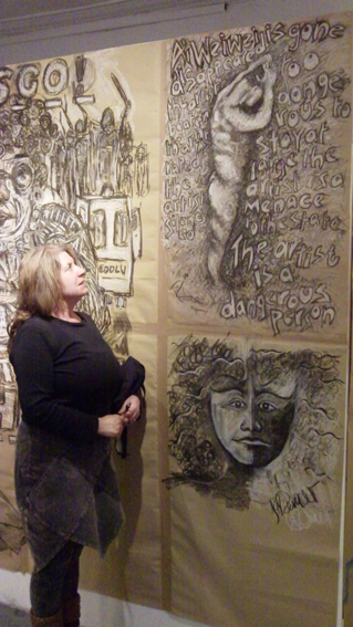
Life drawing was a regular item on the curriculum when I was at Art College and I’ve kept practicing, going to local groups and classes for many years now. It’s good to work with different models and to be inspired by the techniques of artists in the group and I link the life drawing to my anatomical studies of Felicity, the skeleton I borrowed who lives in my studio, standing in a window overlooking the street, scaring passengers who look up from the bus stop below. I like understanding how the mechanics of bones work under the skin. This drawing of one of our older male models was done in chalk, compressed charcoal and conte crayons onto brown wrapping paper. It’s pretty large, about A0 and I’ve barely managed to fit the figure into the space. Egon Schiele had the same problem, so I’m in illustrious company. This model is short but otherwise monumental and I think I’ve captured a sculptural quality in this drawing, which is very much like him.


Trains, Planes and People Watching on the NJT

Ink drawing: people-watching on the NJT.

Trains are great places for drawing because you can settle down in relative comfort and people are generally static for a reasonable time often dozing or absorbed in books or conversation. These are two drawings I did on one of my USA visits, travelling regularly between New York City and Princeton on the New Jersey Transit [NJT]. The drawings are done with Faber Castell Pitt pens into an A6 Cotman sketchbook which is a nice easy size for carrying around and has good quality paper. I think the woman with the large earrings knew I was drawing her.


Ink drawing: Train Talk on the NJT.

The NJT was always very crowded, whatever time of day or night I travelled, possibly because it stopped at Newark airport, which is really cool and has a monorail to take you from the station to the terminals. I got really absorbed in drawing the chap standing up, the way his hand grasped the rail and also the baggage which made interesting shapes. The trains had these weird seats in pale caramel leathery material. They could be swivelled round to face the other way so groups of four people could sit together.


Vibrations of the Bauhaus.

Drawing: John reading in red and green.


This is a rare drawing of my usually nude model with clothes on, relaxing and reading. I drew this pose onto very large paper using rough chalky pastels and colour ink wash in a very limited palette of red and green, which are complementary colours on Itten’s colour circle. This sets up a tension between the colours in the eye of those looking at it. It’s 37 years since Johannes Itten’s book on colour theory was a set text in my first year at Art College and I’ve never been without a copy since. Not only was Itten a great theorist and teacher, but the courses he developed at the Bauhaus influenced the Foundation courses in British art colleges two generations later. His teaching was so influential it still vibrates through art practice all these years later.