Trains, Planes and People Watching on the NJT

Ink drawing: people-watching on the NJT.

Trains are great places for drawing because you can settle down in relative comfort and people are generally static for a reasonable time often dozing or absorbed in books or conversation. These are two drawings I did on one of my USA visits, travelling regularly between New York City and Princeton on the New Jersey Transit [NJT]. The drawings are done with Faber Castell Pitt pens into an A6 Cotman sketchbook which is a nice easy size for carrying around and has good quality paper. I think the woman with the large earrings knew I was drawing her.


Ink drawing: Train Talk on the NJT.

The NJT was always very crowded, whatever time of day or night I travelled, possibly because it stopped at Newark airport, which is really cool and has a monorail to take you from the station to the terminals. I got really absorbed in drawing the chap standing up, the way his hand grasped the rail and also the baggage which made interesting shapes. The trains had these weird seats in pale caramel leathery material. They could be swivelled round to face the other way so groups of four people could sit together.


Vibrations of the Bauhaus.

Drawing: John reading in red and green.


This is a rare drawing of my usually nude model with clothes on, relaxing and reading. I drew this pose onto very large paper using rough chalky pastels and colour ink wash in a very limited palette of red and green, which are complementary colours on Itten’s colour circle. This sets up a tension between the colours in the eye of those looking at it. It’s 37 years since Johannes Itten’s book on colour theory was a set text in my first year at Art College and I’ve never been without a copy since. Not only was Itten a great theorist and teacher, but the courses he developed at the Bauhaus influenced the Foundation courses in British art colleges two generations later. His teaching was so influential it still vibrates through art practice all these years later.

People Watching in Grand Central Station

Ink sketches: Heads in Grand Central Station.

When we visited New York City a couple of years ago we often went to Grand Central Station because it was easy to find our way there and it’s a fabulously beautiful building. It also has a very good dining concourse with little stalls selling food of all nationalities around the edge with loads of tables and chairs in the middle so everyone takes their food into the dining area to sit and eat and there’s an eclectic mix of travellers, sightseers and homeless people taking refuge from the freezing weather outside.

I often just sat and drew the people around me, a good opportunity for studying faces. This is one of the pages I did in Faber Castell Pitt pens into an A6 watercolour sketchbook. The young man was impeccably dressed and carried a very expensive briefcase, obviously wealthy and he sat very quiet and still and read while he drank his coffee and waited for his train. The smartly dressed older man seemed deep in thought and ate very, very slowly, chewing each mouthful very methodically. The elderly man in the hat was homeless and needed somewhere to doze. He kept falling asleep but security personnel woke him up whenever they spotted him. They didn’t move him along, just shook him awake and asked him politely not to sleep. The woman in the hat was extremely grumpy, complaining to her companion who didn’t get a word in edgeways. She had the biggest burger I have ever seen and didn’t once stop talking while she ate it – so much for not talking with your mouth full!


A Dragon Kimono

Ink drawing: The Dragon Kimono.

Sometimes in the life drawing group we draw the models with their clothes on, just for a change. Some of our models are quite flamboyant characters and have some intriguing clothes with them. This model had a fabulous kimono with a Dragon and flowers embroidered all over it. Here she is with the robe in the life drawing studio at Swansea Print Workshop.

The drawing is in Faber Castell Pitt drawing pens into an A3 Cotman sketchbook.


A Lovely Bit Of Gothic

Ink drawing: The Gothic Station in Copenhagen.

We visited friends in Copenhagen last winter – lovely city – amazing towers everywhere. We climbed one of them – The Church of our Saviour, a twisty one that went up 300 feet or so. Not a good idea, not a good idea at all when you’re terrified of heights! I’d intended to draw from the top, but ended up clutching the wall and handrail, whimpering in terror while small children skipped merrily past, oblivious to the hideous life threatening danger. I stayed at ground level from then on.

Although I normally draw people [and cats], it’s nice to draw the places I visit because it’s more memorable than taking photos. It’s easy to rattle off thousands of digital images but what are you going to do with them all when you get back home? I prefer to look critically around me for something interesting and memorable to draw [and if I’m honest, something that I’m capable of drawing lol].

We’d been on our feet for hours and wandered into Copenhagen’s magnificent train station. We sat down for a coffee and a rest and I drew the scene in front of me. It’s a gorgeous mess of stone, cast iron and wood, cathedral-like in places, soaring high above modern bland, mass produced kiosks. It’s a challenge drawing architecture so that it doesn’t end up looking like an architectural drawing. There’s no point in that – the architect did it better!


The drawing is in Faber Castell Pitt pens into an A6 Cotman watercolour sketchbook.


An Ancient Fort in Shangri-La

I was lucky enough to go on an amazing trip round Pakistan a couple of years back and spent a few days up in the mountains in the North East of the country, not far from the Chinese border. We stayed in Karimabad, a small village thousands of feet up in the Karakoram Mountain range. Our lovely little hotel was set at around 4,500 feet and we craned our necks as we sat on the verandah to see the mountain tops, at around 30,000 feet. It was Springtime and the entire valley was smothered in the pale pink blossom of tens of thousands of apricot trees; a staple crop, Oxfam sells them in Britain and they’re delicious.

The Hunza Valley is reputed to be the inspiration for the novel Shangri-La and it was an exhausting journey to get there, two and a half days on the Karakoram Highway, the little minibus struggling slowly as we climbed up the Indus Valley towards China. The sense of scale is staggering. There is nothing like it in Britain. Snowdon, the tallest mountain in Wales and England, is 3,000 feet, lower than our Karimabad hotel. I sat on the verandah in a little wicker chair padded with beautifully embroidered cushions, in the Spring sunshine, sipping green tea from delicately painted china cups and drawing with ink and wash.

Ink and watercolour: Baltit Fort, Hunza.

I don’t usually do landscapes, but I had to try and get something of this glorious country into my sketchbook. This is the view I saw; the ancient fortress of Baltit built on a precipitous rocky outcrop at least another thousand feet up again from my hotel and the ‘Lady’s Finger’ peak towering above. The area is glacial so there is no rain but snow lies on the mountain tops all year round. Villagers grow their crops by careful irrigation and an ancient technique of ‘seeding’ the glacier, which encourages it to spread down the mountain towards the villages.

The drawing is done in Faber Castell Pitt drawing pens and coloured with watercolour washes, using Windsor and Newton artist’s half pans into an A3 Cotman watercolour sketchpad.


The Pavement People

Ink drawing: Pavement People.


Working from photographs can be controversial for many artists and causes a lot of lively discussion in our local Life Drawing group. I take a pragmatic view – I do whatever needs to be done to get the image I want and that sometimes means using a photograph as my starting point. This ink drawing started life as a digital photograph taken outside our local ‘soup kitchen’ where the Pavement People gather around 8.30 am for breakfast. I wanted an image to incorporate into a much larger mixed-media piece. I used Adobe Photoshop to turn the colour image to black and white, then I passed it through an Artistic Filter, the Cutout one. This reduced the amount of grey tones and gave a slightly abstract edge to the figures. The process also blurred some of the faces, which I like because the Pavement People tend to slip into the background and become faceless members of society.

I printed it out and drew a grid over it, scaling it up onto a sheet of tracing parchment in pencil. I then drew it it ink, using mainly Faber Castell Pitt pens and Indian ink and brush. I emphasised the blurred, faceless quality of the figures. The next stage is to rub out the grid marks and transfer the image to a photographic silkscreen to print over the mixed media piece I’m currently working on. I might also print it up as part of a series I’m planning, using a number of photos I have of the Pavement People,  along the lines of William Hogarth’s serial engravings.

Scribbling Kitties

Monotype: ScribbleCat On A Mat.


Sometimes it’s nice just to scribble. I normally have a very structured approach to drawing; very analytical and finished. Now and again it’s good to loosen up and have a scribble. One day I was sitting an exhibition at elysium gallery and I started scribbling randomly in a tiny sketchbook. The scribbles built up into cat-like shapes. So I added little faces and ended up with a whole load of scribblecats. I traced them and used the tracings to make direct line monotypes onto tissue paper [archival quality of course]. I also monotyped some background mats in yellow onto Zercoll paper. I cut out the monotype scribblecats and stuck them over the monotype mats. Hey presto, a whole series of little scribblecats, each unique. I’ve sold quite a few.

We used to have two brother cats, long-haired whites called Fred and Sialco. Fred was the eldest and a rather maladjusted moggy with a laissez faire attitude to hygeine – we were forever cutting dreadlocks off him. Sialco on the other hand was a beautiful and fastidious little guy who enjoyed visiting local pensioners and persuading them to spend their pensions on chicken and smoked salmon for him. One Christmas I decided to take Sialco to visit an elderly neighbour who was rather fond of him and dressed him up in a big Xmas bow for the visit. He was NOT amused. His expression was just like the one on this little Scribblecat here. 🙂


In Praise Of The Older Man

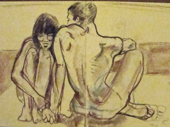
I deplore the ageism that seems endemic in British culture and I address this in my art by using elder models in a lot of my work. We have two brilliant elder models in our life drawing group in Swansea, one male, one female, who are both retired professionals and art lovers. They’ve been modelling for many years and love it and bring so much experience and humanity to the process. I think it’s fascinating to observe the ageing process in the human body and I think a model in their 70’s is every bit as interesting and beautiful as one in their twenties. We really should grow up as a society and stop being so obsessed with the blandness of youth.


This is a large life drawing done into an A2 brown paper sketch book with white, black and sanguine conté crayons.

On The Other Hand….

Charcoal and pastel: Left Hand Drawing.

I draw everyday. It underpins my professional practice. Sometimes I go on courses to be shaken out of my complacency because it’s too easy to stay in your comfort zone and not take any risks. This means that you don’t develop. I’ve been working with a very good drawing teacher at a local college and she encourages artists to regularly draw with the ‘other’ hand, in my case it’s the left. I’ve produced some drawings I’ve been very pleased with using this method. It’s a bit weird. For a start, your ‘normal’ hand and arm are used to the exercise you’re giving them; your other hand isn’t and it’s pretty tough at first when you realise just how much effort drawing at an easel is and how much strain it puts on unfamiliar muscles.

You’re also using the ‘other’ side of your brain so the way you observe and interpret what you’re seeing is different. I find it easier to set the model within the space when I’m drawing with my ‘other’ hand, although the line is more wobbly because I don’t have such a good level of muscle control. I guess I’m using the side of my brain that governs spatial things – that’s about the limit of my scientific knowledge!

This is a large easel drawing in charcoal and chalky pastels onto sugar paper. I found it much easier than normal to get the proportions right and to do tricky bits like the hand.