
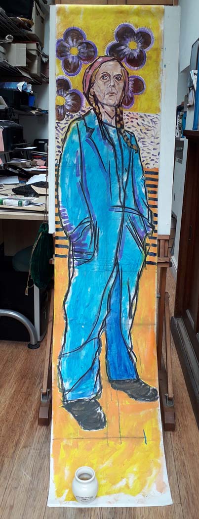
I carried on painting today. I’m just doing a bit at a time because I tend to get very stressed over painting, which doesn’t happen when I draw or make original prints. So I’m just dashing over to it, slapping some acrylic paint on it, then dashing away to do something else. Today I put a wash of orange over the yellow towards the bottom of the canvas roll. It’s a complementary colour to the blue and I like using complementary colours – they create such intensity. I also started to block in some darker areas on the overalls, overlaying the cerulean with a red-biased pthalo blue. I’m using Liquitex Heavy Body acrylics, mostly transparent or translucent as I like layering glazes over each other. This is a portrait of the artist Patti McJones that I started 5 years ago, it’s a big piece, almost life size.

Bravo!
Thanks Genie 🙂
I really love this, seriously i really do, the colours are fab and the subject is so bloody cool looking in her overalls.
Thanks so much, David
Can’t go wrong with complimentary colors, which is why this somewhat lazy artist consistently employs them!
Haha I would never describe you as lazy lol 😀
Beautiful addition of color!
Thank you Sharon