More Left Handed Shenanigans

Drawings with my left hand.

I’m busy clearing out my studio at the moment to move to a new, bigger studio across the road and I’m using the opportunity to sort through and catalogue my work and also to be ruthless and bin stuff that doesn’t come up to scratch. I found this study and it’s more of the left handed drawings I spoke about recently. It’s a useful exercise to draw with your ‘other’ hand because it engages parts of the brain you don’t normally associate with drawing. These three heads were 5 minute poses drawn onto an A1 sheet of sugar paper with soft chalky pastels. In some ways I find it easier to draw with the other hand because I seem to be more analytical and the measurements and likenesses are easier to do. But the line is definitely more wobbly and harder to control, although sometimes it works very well like that. This is another elder model who has a brilliantly craggy and expressive face – great to draw.


Curry, Conversation And A Missed Blog!

Ink drawing over a transfer print.


Didn’t do my daily drawing blog yesterday!!!!! I went out for the annual Life Drawing Group curry, to the rather excellent Vojon Restaurant in Swansea and by the time I got home it was way too late to blog. I thought I would have had enough time as we met at the curry house at 7.30 but we all had such a good time that we didn’t get home ‘til after midnight. It’s always hard to choose because it’s such an excellent menu but they have a garlic-lovers selection and I was in the right mood for a garlic overdose, so I had the Garlic Lamb Frezi with garlic rice. The garlic rice was so garlicky that it’s probably best described as a spot of rice in a bowl of garlic. Delicious. Luckily husb also had the garlic rice, so we were able to sleep in the same bedroom.

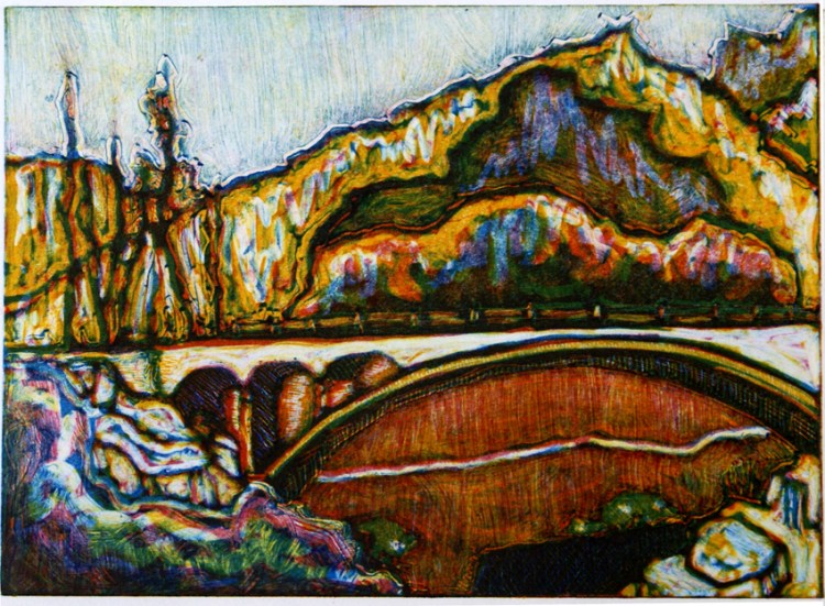
There were seventeen of us, fourteen artists of all ages and three of our fabulous models. One of them is in this drawing. He’s one of our baby boomer models and he’s a joy to draw. I’ve used as my base a piece of Bockingford 250 gsm. I did a transfer print onto it some time ago, using a photograph [of an ancient mountainous village in Northern Pakistan] which I printed out with an ordinary inkjet printer. I placed the image face down on the Bockingford and quickly brushed the back of it with acetone [nail varnish remover], slapped a bit of tissue paper on top and speedily trundled it through one of the etching presses. This transferred the image onto the Bockingford, but in the process the image can change quite a lot, especially the colours. After all that palaver, I decided I didn’t like it so I drew on top of it in Faber Castell Pitt pens. Then I liked it 🙂


In The Life Drawing Studio [2]

Ink sketch: model and artist.

One of the things I love about being an artist is that it’s a life-long pursuit. I know little tiny budding artists only a few years old and I work with veteran artists in their seventies and eighties and all ages in between. I remember Bill Turnbull interviewing Howard Hodgkinson on BBC Breakfast a couple of years ago and he asked when Howard was going to retire. HH put him straight. It isn’t a job. It isn’t something you retire from. It is a state of being, not a state of employment.

Our life drawing group has a wide cross-section of artists, from school students in their teens who are amassing life drawing for their A level Art portfolios to artists in their eighth or ninth decade with a lifetime of experience – of art and life – behind them, still exploring, still innovating, still doing…… There are roughly equal numbers of male and female artists involved in the drawing group, although the membership of the printmaking studio itself probably has more women.

This is a detail from a drawing done in Faber Castell Pitt drawing pens into an A3 Cotman watercolour sketchbook. I went through a phase of using textured watercolour paper for sketching, mainly because I’d found a very cheap source of them for a while.


A Left Leaning Lady Scribbled Leftily

Life drawing in soft pastels.

I think I’ve mentioned before that it’s good practice to draw with the ‘other’ hand, in my case, the left. It engages the other side of your brain and makes you look at the subject and drawing in a different way. I find that I’m more analytical and the drawing is in some ways more technical when I do this, while the line is less accurate and more wobbly, so there’s an interesting tension going on in the drawing.

This is one of our fabulous group of life models drawn onto a large piece of brown wrapping paper in soft chalky pastels.

A Baby Boomer With Red Stripes

Mixed media portrait.


I like to prepare paper to draw on because white paper can be very inhibiting and slapping some bits of paper over it sort of ‘breaks the duck’ and kickstarts the creative process. Sometimes the altered surface leads me in a completely different direction with my drawing. My comfort zone is Faber Castell Pitt pens but I’m more likely to use different media for drawing if I prep the paper first.

The drawing is done on a piece of Somerset 250gsm, it’s around 40 x 25 cms and was prepared with a red handmade Indian paper. I used conte crayon in black, white and sanguine.

In this piece, I got carried away with patterning which was great fun. Our model is a ‘baby boomer’ who has been modelling for our life drawing group for many years, a seasoned pro. I like drawing older models; I like the character that age and experience brings to a face and body.


Central Heating Broke! But The Cats Are Alright!

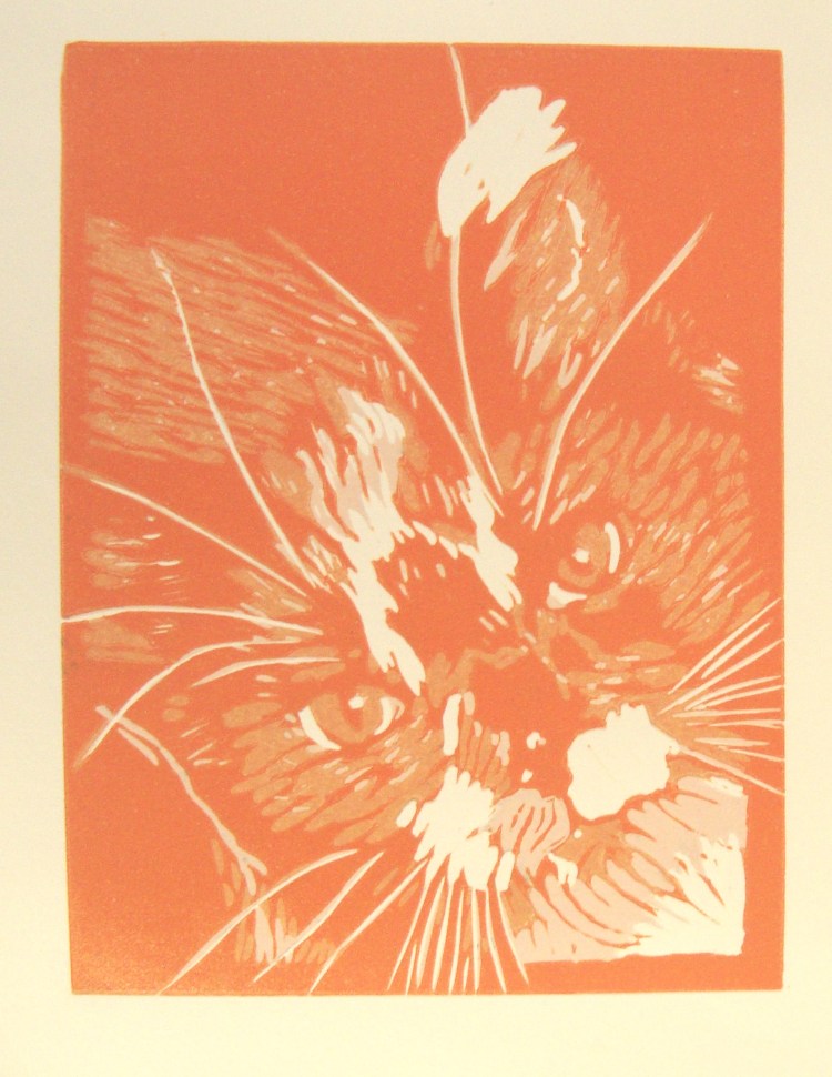
Ink drawing: Ming the Cat and the remote control.

Disaster. Central heating malfunction. In the middle of winter. At the weekend. Freezing cold, pouring with rain. Had to go out to buy food, got soaked, couldn’t dry anything when we came home. We’ve battened down the hatches, drawn the heavy curtains, huddled in one room with an electric heater and filled some antique stoneware hot water bottles that we bought in a junk shop many moons ago. So with these and a load of blankets we’re managing to stay quite cosy until the gas engineer calls tomorrow.

The kitties are especially fond of the stoneware hot water bottles as they keep their heat throughout the night and radiate it through the duvet and blankets.  Their thick fur coats help too – no consolation for we hairless humans though. Here’s little Ming cwtched on a blankie watching the TV, guarding the remote control. She’s particularly fond of David Attenborough documentaries. Faber Castell Pitt drawing pens into an A6 spiral bound sketchbook.

Tomorrow there will be warmth!


Hugo, Steampunk and a Warrior with a Mohican.

Drawing: Portrait of the warrior.


Went to see a fantastic film earlier – Martin Scorcese’s ‘Hugo’. Brilliant, moving, exquisitely filmed. It’s very atmospheric and a bit Steampunky. Amazing visually. The drawing has nothing to do with the film but it’s also quite atmospheric and stylistically it reminds me a bit of some of Whistler’s drypoint etchings, not that I’m in the same league at all! It also puts it in the same sort of era as Steampunk, Victorian / Edwardian –  maybe that’s a bit tenuous lol 🙂 Anyway, it sort of reminded me of the atmosphere of the film so here it is.

The model is a young soldier and he had a bit of a Mohican hairstyle going on at the time. I generallydraw him in pens but on this occasion I was inspired to draw him in graphite blocks, 6B and 9B, which is what I think gives it that ‘drypoint’ feel to it. The drawing is in an A3 bound sketchbook. I haven’t looked at it in ages and I remembered it because of the film earlier, I think I might go down to Swansea Print Workshop next week and do a drypoint from this. I don’t use the traditional copper plates –  too expensive. I use Intaglio Printmaker’s paper drypoint plates, which are a fairly thick card with a plastic coating and they’re really cheap. They give lovely results although you’ll be lucky to get an edition of 10 prints from one.

Double Difficulty: Drawing Two Models.

Drawing in conte crayon: male and female.


Oooh this was a tough one. We were lucky enough to have a couple model for us at life drawing group last night but what a challenge. Two heads = two portraits. Four hands and four feet = one heck of a lot of work! It’s hard to focus in on what’s the most important – do you try and get both people in or concentrate on one? The proportions and perspective are much more complicated and then there’s the extreme difference between African and Caucasian skin tones – so where do you start? And end? What HAS to be included and what can you leave out? It’s unfair to expect the models to hold a pose for twice as long as normal, so in effect you have half the time you’d normally spend drawing each person.

This is the only drawing I’m happy to show and I’m not that pleased with it; it’s okay. The others are strictly practice and very sketchy, focussing on the technicalities of fitting the figures together rather than trying to make a piece of art that works well. It’s done in conte crayons in white, sanguine and black into a large cream sketchbook, using both pages. As you can see from all the wrong lines, it was really challenging. Good exercise though – wouldn’t mind doing it again.

A Lovely Lovely Line

Mixed media: work in progress.

Sometimes when you’re drawing you get into the physical act of it, where you’re not just trying to create an image of something, but you’re also getting into the beauty of the mark. I had one of those moments earlier today when I was working on a large drawing in the studio. This started life as a life drawing in my sketchbook and has been through a couple of incarnations as a direct line monotype and more recently as a large three-colour monotype. I really like the original image so I decided to work it up as a very large drawing which will probably be the basis for a mixed media piece that I’ll work on after Xmas.


I started off with a large piece of Fabriano 350gsm that I’d previously coated with an acrylic ink / medium mixture, applying it randomly with a squeegee. I started to work up the drawing in black and white conté crayons and then went over the black lines with a transparent oil bar. The bar made the conté line semi-liquid and it flowed beautifully. I got right into the physicality of it and when I stood back to look at it, the line wasn’t at all true to nature but nevertheless it’s a gorgeous, sensual, lush line. In my humble opinion. Sometimes that’s enough.


Hiding Behind A Hand

Ink drawing: Hand and Face.

Portraits are so often a way of the wealthy and powerful showing off their wealth and power and so they usually show the entire face of the person paying, hopefully, a great big wad of cash to the artist. Egon Schiele did a lot of drawings and paintings of hands covering faces and I like the way that the presence of a hand alters the whole image, from one of confidence in a full facial portrait to an image that is far less confident and assured. The hand gives an impression of guardedness and uncertainty. I also like the way that the digits sink into the flesh and distort it. This sketch took me 25 minutes in Faber Castell Pitt pens into a spiral bound sketchbook. The hand took loads of time – they always do, but also the way the thumb sinks into the cheek is unfamiliar and took a lot of cross-checking.