Elysium Artspace is sponsoring an international painting competition, BEEP, in May and I thought I’d go for it. Now, I’m a printmaker and a scribbler, not a dauber, so I’ve decided to approach it from that angle, using printmaking and drawing tools to create a painting. Normally my work is quite simple and self-contained, using just one subject, usually a solitary nude figure but the topic for this competition, Dystopia, has spurred me on to try a multi-figure piece with at least five people in it. The composition that I’ve sketched out is a complex one so I find myself in the position of having to do an awful lot of preparatory drawings. I’ll usually do a simple prep sketch as the basis for my printmaking, but they’re not normally detailed. For the BEEP thing, though, I’m rattling off loads of preliminary drawings and thoroughly enjoying the experience, which is a new one for me. Here are a few in progress. I’m really excited about it. I’ve been using a squeegee and a roller to apply oil pigment to a huge piece of prepared cardboard. I’m in good company, Gerhard Richter has done lots of paintings with a squeegee and Toulouse Lautrec painted onto cardboard. I’ve got about 2 months left to complete it so I’d better crack on because I have to remember the drying time for the oils. Dystopia is a pretty grim topic and some of the drawings are getting me down, so it’s good that I do a lot of sketchbook work of the daily life around me, which helps to ground me and shake me out of the deep and dark things going on in my head.
Today I exchanged a piece of art for a generous amount of home-produced charcuterie. Here’s the blog about it 🙂
A post that strays somewhat from charcuterie, towards another of my obsessions: collecting art works. I’m a compulsive hoarder, and I’m terrible for buying paintings, drawings, photographs, etchings, prints and sculpture. Today marked my first ‘Meat for Art’, when a block-print was exchanged as payment for bacon and sausages.
However, this isn’t my first charcuterie related art acquisition. During my HCC Scholarship to the US last year, I’d stopped in Brookings, Oregon to call into their Farmers Market. Across the road was an antique shop, I wandered over for a browse and came across a collection of pig drawings. They were owned by Elmo Williams, an Academy Award Winning Film Editor. I can’t put my hand on his biography at the moment, but if my memory serves me correctly the story goes; that he would ask any visitor to his office to draw blindfolded the picture of a pig…
View original post 536 more words
The Random Scribbler.

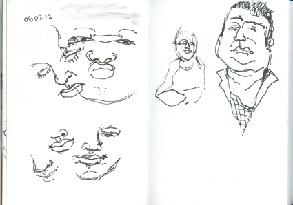
My family get dragooned into posing – Lucien Freud did the same, not that I’m putting myself into his illustrious category :). My young great niece spends Monday evenings after school with me and as we’re no longer allowed to send children down the mines or up chimneys I decided to get some use out of her, as payback for the enormous amounts of pizza it takes to fill her. Trouble is, the moment you tell her to sit still and pose, her face starts to fidget. Never mind, it’s good practice. The other people were sketched at random. Not brilliant art, but even tiny random scribbles like these help to develop my eye and zoom in on what’s important in a drawing, what marks need to be made.
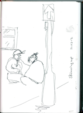
Skinning Up In The Sunshine.
Sometimes when you’re a scribbler you have to move quickly and have just seconds to get something down on paper. This happened to me today when I was exhibition-sitting at Elysium Gallery. I glanced through the window and saw this young couple sit down on the other side of the road, take tobacco, papers and cannabis out and start rolling a joint. It was lunch-time and bright sunshine in the city centre, but they seemed completely unaware of anyone else as I fumbled around in my bag to find my sketchbook and pen. When you’re working fast you have to zoom in on the most important lines to get something recognisable. I managed this much before they pulled themselves up and tottered off on unsteady legs out of my sight, passing the lit joint between them as they headed for the main street.
They couldn’t have been more than 17 or 18 and had those pinched, skinny little bodies that have obviously never known nurturing, certainly not a couple of healthy middle class students cocking a snook at the establishment by having a radical spliff in the sun. I’m no goody two-shoes, having lived through the excesses of the Seventies, but I felt sad for them that they have so little going for them that they didn’t care about being caught and punished. They probably have nothing to lose, no future career, no reputation, so why should they worry? Our city centre, like other cities, has many young people like this wandering around, painfully thin, intoxicated, clutching cans of Special Brew and spliffs, with nothing going for them. They’re just kids….how do they slip through the net? How have we got it so wrong? We shouldn’t be failing kids like this in one of the wealthiest and most liberal countries in the world.
Field of dreams.
Lovely blog from the amazing Doodlemum featuring Arnie the Cat doing what cats do best.
Mucky Little Kid

When I was little, Swansea beach used to be packed all through the summer. there were no cheap package holidays and most people couldn’t afford to go away; a bus trip to Barry Island if you were lucky. So there’d be thousands of kids on the beach, changing into those funny little shirred swimsuits behind towels and we’d run screaming down to the water with our Mams shouting, “Don’t go in the Granny’s Custard!”. Of course, we all made straight for the Granny’s Custard. It was black, cool, silky and squelched between your toes. Once it dried on your skin it was really hard to get off. I remember Mam scrubbing me with a nailbrush in the bath trying to get me clean. It hurt, but it was worth it.
When I grew up I went to Art College and on our Ceramics module we had to go to the beach and dig up …….. the Granny’s Custard. Turns out it’s a lovely smooth terracotta clay. We learned how to clean and process it and we made small pots, fired with a white tin glaze. I did this sketch for someone yesterday and didn’t have my nice digital camera so used my phone camera for the first time. It’s rubbish. Won’t bother again. It’s little Me squelching through the Granny’s Custard with a look of ecstasy on my face 🙂
Rhubarb And Compost
I spent a few hours in the garden this afternoon, potting up some peas, leeks and mange tout ready for the allotment and tidying up after the winter. We collected some large compost bins from Swansea Community Farm last summer, put two onto the allotment and kept one for the garden and I had a look through the hatch today and there was loads of nice crumbly compost, not smelly at all. I love compost. I’m a bit obsessed with it. I like to visit the Centre for Alternative Technology in Machynlleth just to look at their compost corner. They experiment with making compost in different ways and I find it fascinating. Well, it keeps me off the streets 🙂
I dug some out and spread it around the rhubarb which is growing away very nicely – might have some for crumble in a couple of weeks. It grows really well in the back garden but didn’t like the allotment at all when I tried it. It’s really expensive in the shops these days but we get so much of it each year that I have to make chutney. It’s delicious. Here’s the recipe.
Rhubarb chutney
Great with cold meats, cheddar, cheese on toast, smoked fish, curry.
For each kilogram of washed, roughly chopped rhubarb, add –
- 250 g of sultanas
- 850g white granulated and 150 g dark brown sugar
- 300 ml cider vinegar
- 10 peeled, chopped cloves of garlic
- 30g sea salt
Put everything into a very large pan and bring to the boil.
Cook at a good simmer for at least an hour until it is thick, stirring occasionally.
Pour into clean, hot jars and screw the lid on immediately (use waxed and cellophane jamming circles if you have some).
Label and date and store for at least a month before using, if you can resist it.
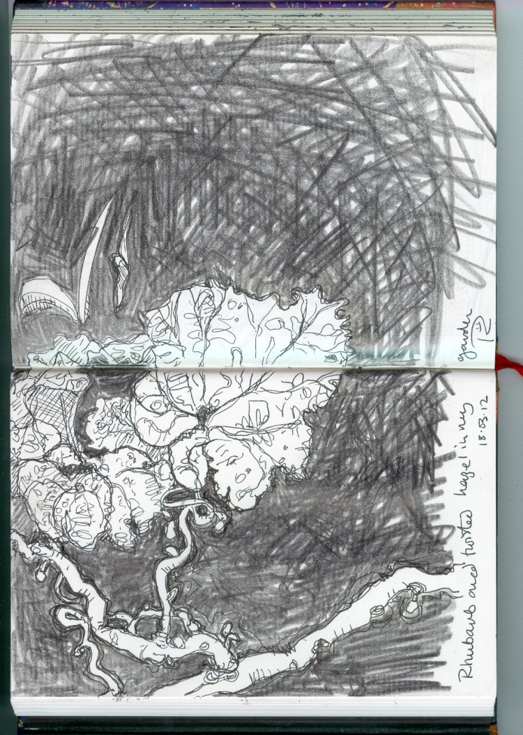
The drawing was done with Faber Castell Pitt pen size S and a lump of graphite. I have a twisted hazel [corylus avellana ‘Contorta’] in a large pot in front of the rhubarb patch and I drew through some of the little twisted branches. In the background are a couple of Spanish bluebells [hyacinthoides hispanica] spearing through the ground. They were already here when we moved in and although pretty are also very invasive.
A Bit Like New York?
Yesterday was the official opening of the new Elysium Artists’ Studios on Mansel Street. We’ve all been working on the building for the past couple of weeks to get it ready for the public and I did my best to tidy up my own studio and get work up onto the walls. It was good to spend some time going through my work and decide what to put out and also to rediscover pieces I’d forgotten about.
Here’s the view through my North-facing window after I’d tidied up. The old plans chest is one of the most invaluable pieces of furniture I’ve ever owned. During the opening, I used it for serving mocktails and home-made cake, assisted by my poor long-suffering husband.
Here’s the view from the window end, facing the door with some of my work displayed in the corridor outside. Later on that evening the place was jam-packed. I don’t think I’ve ever been anywhere so crowded. It was brilliant. Someone said it was more like New York! I don’t know about that, but I haven’t been to anything quite like it in Swansea before.
Here’s some of the work I displayed; on the left a series of blockprint portraits done from my travels in Pakistan a few years back, along with some linoprints of petroglyphs carved into the rocks of the Karakoram mountains. On the back wall, two more recent full-colour monotypes. It was a terrific night but so busy that I didn’t have enough time to speak to everyone, so if you’re one of the people who came along, thank you ever so much and I’m sorry I couldn’t spend more time with you 🙂
Open Studios Coming Up.

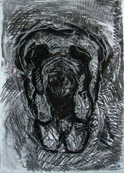
Getting into some serious drawing lately, using fairly large discarded prints because the paper is good quality, usually Somerset or Bockingford, along with charcoal, compressed charcoal, chalk and transparent oil bar. I worked up this large [A1] drawing from a tiny life drawing in my sketchbook. I covered the paper with loads of random scribblings before starting to shape the image within it. It’s one of the ones on my wall for the Grand Opening of the Mansel Street Studios this coming Friday. If you’re in Swansea between 7 and 9.30 pm, be sure to come up and see my etchings 🙂 . The main stairwell and corridors have been filled with an exhibition of work from the two groups of Elysium studio artists, there’ll be wine and nibbles in the exhibition and I’m serving cake and mocktails at my studio. Would be lovely to see you.
Chooks At The Vetch.
Had a nice diversion this afternoon after picking up my niece for babysitting. We went down to The Vetch Field, Swansea’s old soccer ground in the city centre, which has now been cleared and turned into allotments. There are chickens there too and the sprog and I spent an hour with sketchbooks, charcoal and pastels drawing the allotments and especially the chickens. Vetch is a type of wild legume and the field was transferred from The Swansea Gaslight Company in 1912 to the newly formed professional football team. It’s nice that now it’s been cleared, plants flourish there once again. Not all of it is allotments so maybe vetch will reestablish itself once again. The drawings are done in charcoal and oil pastels into a heavyweight cream Somerset sketchbook. I’ve never drawn chooks before – they don’t stop moving!


