Every Winter, Santa’s Parade snakes out of the city centre along the main road at the end of our street. The pavements are usually lined with cheering crowds and the ladies of the brothel-at-the-end-of-our-road normally hang out of the windows and wave at Santa and the passing floats and bands. This year seemed rather subdued though, with fewer people on the streets and much more reserve; children cheered and waved as much as ever, but the adults were quite reticent. And the ladies of the brothel stayed in the background, peeping shyly out of the windows, half hidden behind nearly closed blinds with shadowy figures looming behind the shades. Are we all feeling down because of the unrest in the world this year, the continuing wars in Afghanistan and Iraq, the economic crisis?
It was a very cold evening and despite wearing fingerless gloves I didn’t do much drawing, just a few scrappy sketches. However, there was enough to rework in the studio into a more coherent drawing which I’ll be turning into a photographic screen print which, along with loads of other drawings, will probably form part of mixed media pieces I’ve planned for the New Year. The drawing is very small, in Faber Castell Pitt drawing pens onto tracing parchment which is translucent enough to be used in the photographic screen process.

I spent a long day at Swansea Print Workshop today making a large full-colour monotype. It’s a technique used by the Impressionists – Degas and Monet used to work over their monotypes in oil pastels. I started with a drawing in my sketchbook that I’d done in life drawing group. It’s gone through several incarnations including a scaled up drawing in conte crayons onto brown wrapping paper. I traced it to make a template and registration sheet for my planned monotype. It’s a complex process involving inking up a perspex plate three times, once in Process Yellow, once in Process Red and finally in Process Blue. At each stage, I make a drawing using the tracing as my starting point. The technique is great for exploring intensive mark-making. Firstly I print the yellow ‘drawing’ onto BFK Rives 250gsm paper. Then the red ‘drawing’ is printed over the yellow. Finally the blue ‘drawing’ is printed. The overprinting of the three translucent oil colours gives a full colour range from black to white and everything in between. I find it a very exciting technique to use. The model is a regular at our life drawing group and is a ‘Baby Boomer’ – I like using older models.

The technique is very long and involved and I spent the whole day on my feet and a lot of time turning the wheel of an enormous Radcliffe intaglio press. I’m shattered now but I’m well-pleased with my monotype. 🙂

It’s nice to work with a veriety of models of all ages, fascinating to see the human body going through different phases. This is an experienced older model whose body wrinkles up beautifully. I know that goes against what’s currently our culture’s idea of beauty, but I like it – great to draw a body and face like this. It’s just a quick sketch using chalk and compressed charcoal onto a large sheet of brown parcel wrapping paper. I know it’s not archival quality paper, but sometimes it’s nice to use something really cheap because it frees you up, you’re not inhibited by the cost of a pristine new piece of artpaper. It’s also nice to work on a darker ground, white can be inhibiting. I think I might work this up as a 3 colour monotype sometime.

I’m not a painter. But sometimes I wander over to the dark side and have a go. Trouble is, I really don’t like paintbrushes. There’s just something a bit wussy about them. I like big fat sturdy Japanese rubber printmaking rollers and great big tins of stiff printmaker’s inks, not faffy little brushes and itsy-bitsy weedy tubes of runny paint. Now thats insulted all the painters I know lol. Anyway, this was one of my ventures into the dark side, but I couldn’t bear to use brushes so I indulged myself in a fun bit of finger painting instead. Not bad, but would be much better as a block print 😉
Oooh got to go and get my corset and big hat on and go to the monthly Steampunk Meet so won’t have much time to post today. Here’s a large drawing I did from a small life drawing in a sketchbook. I used a large piece of Somerset Velvet, coloured with black and pearlised acrylic paint squeegeed onto the surface a la Gerhard Richter. I workined it up with conte crayons and soft pastels.

Now for some Earl Grey tea, cucumber sandwiches, ladies in bustles and men with handlebar moustaches 🙂

This large mixed media piece started as a simple life drawing in conte crayons onto Somerset paper [250gsm] that I had squeegeed with black acrylic System 3 ink mixed with pearlised and acrylic medium. This gave me a dark, uneven surface to work on. I collaged on some interesting hand-made papers I had knocking around, tearing them into tiny squares and added a couple of blockprinted skulls that I’d printed up on tissue. I like to use text a lot in my larger scale work, repeating a phrase over and over so that it becomes a rhythmic pattern across the page. I did this onto tracing parchment and pasted pieces over parts of her body. I fnished off the drawing with oil bars.
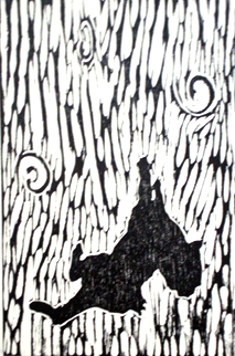
I like to use skulls / bones in my work as it’s in the European Vanitas tradition where artists would constantly remind us of our own mortality. The primitive figure to the right of the woman is a lino print I did based on a drawing of a pertoglyph, an ancient rock carving, I made during a journey around Pakistan. The petroglyphs were carved onto large rocks at the side of the road up the Karakoram Mountain range in the Northern Territories. It’s a very primitive man printed onto a highly textured hand-made paper.
The phrase I used is ” ‘I knows ‘ew luvs me ‘coz ‘ew buys me chips.” This is a well-known Swansea phrase in the local dialect and it’s meant to be a tender declaration of love in these parts. [For non-British readers – chips are fries]. 😉

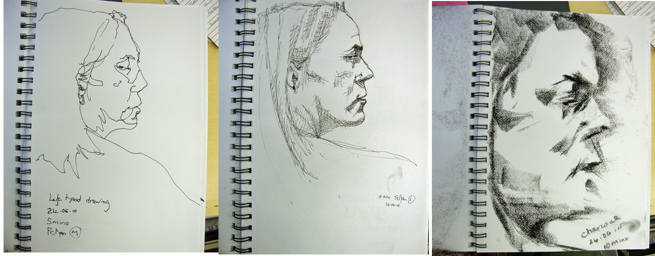
Sometimes I get to hear about art lectures at the local university and friends smuggle me in. I went to one a couple of months ago, a lecture on drawing, given by Professor Deanna Petherbridge. I often draw when I make notes, especially when the subject is something arty. I started out drawing the Professor but then I got fascinated by the dreadlocks on the head of the chap in front of me. Don’t see many dreadlocks, especially greying blonde ones and I couldn’t resist getting absorbed into drawing his hair. And the curly-headed woman in front. Here’s a close up.

It was great doing all that patterning. I’m not a photo-realist so I can let rip and draw what I want. Faber Castell Pitt pens into an A6 silk-bound, recycled sari sketchbook. The paper had an unusual woven texture. I assume it’s because it’s made from sari material.

I always carry a sketchbook and I’m ready to take any opportunity for a quick sketch. I was sitting in a restaurant in Berlin with a group of artists a couple of winters back. It was freezing – literally 20C, and we were eating, drinking and chatting. Jane was gazing out the window into the darkness with her brown handbag on the sill. It’s always a challenge to draw the dark, especially through the reflections of a window, but Jane was deep in thought and stayed still until I finished.
Faber Castell Pitt pens and sanguine conte crayon into a spiral bound A6 sketchbook.