A Lovely Bit Of Gothic

Ink drawing: The Gothic Station in Copenhagen.

We visited friends in Copenhagen last winter – lovely city – amazing towers everywhere. We climbed one of them – The Church of our Saviour, a twisty one that went up 300 feet or so. Not a good idea, not a good idea at all when you’re terrified of heights! I’d intended to draw from the top, but ended up clutching the wall and handrail, whimpering in terror while small children skipped merrily past, oblivious to the hideous life threatening danger. I stayed at ground level from then on.

Although I normally draw people [and cats], it’s nice to draw the places I visit because it’s more memorable than taking photos. It’s easy to rattle off thousands of digital images but what are you going to do with them all when you get back home? I prefer to look critically around me for something interesting and memorable to draw [and if I’m honest, something that I’m capable of drawing lol].

We’d been on our feet for hours and wandered into Copenhagen’s magnificent train station. We sat down for a coffee and a rest and I drew the scene in front of me. It’s a gorgeous mess of stone, cast iron and wood, cathedral-like in places, soaring high above modern bland, mass produced kiosks. It’s a challenge drawing architecture so that it doesn’t end up looking like an architectural drawing. There’s no point in that – the architect did it better!


The drawing is in Faber Castell Pitt pens into an A6 Cotman watercolour sketchbook.


An Ancient Fort in Shangri-La

I was lucky enough to go on an amazing trip round Pakistan a couple of years back and spent a few days up in the mountains in the North East of the country, not far from the Chinese border. We stayed in Karimabad, a small village thousands of feet up in the Karakoram Mountain range. Our lovely little hotel was set at around 4,500 feet and we craned our necks as we sat on the verandah to see the mountain tops, at around 30,000 feet. It was Springtime and the entire valley was smothered in the pale pink blossom of tens of thousands of apricot trees; a staple crop, Oxfam sells them in Britain and they’re delicious.

The Hunza Valley is reputed to be the inspiration for the novel Shangri-La and it was an exhausting journey to get there, two and a half days on the Karakoram Highway, the little minibus struggling slowly as we climbed up the Indus Valley towards China. The sense of scale is staggering. There is nothing like it in Britain. Snowdon, the tallest mountain in Wales and England, is 3,000 feet, lower than our Karimabad hotel. I sat on the verandah in a little wicker chair padded with beautifully embroidered cushions, in the Spring sunshine, sipping green tea from delicately painted china cups and drawing with ink and wash.

Ink and watercolour: Baltit Fort, Hunza.

I don’t usually do landscapes, but I had to try and get something of this glorious country into my sketchbook. This is the view I saw; the ancient fortress of Baltit built on a precipitous rocky outcrop at least another thousand feet up again from my hotel and the ‘Lady’s Finger’ peak towering above. The area is glacial so there is no rain but snow lies on the mountain tops all year round. Villagers grow their crops by careful irrigation and an ancient technique of ‘seeding’ the glacier, which encourages it to spread down the mountain towards the villages.

The drawing is done in Faber Castell Pitt drawing pens and coloured with watercolour washes, using Windsor and Newton artist’s half pans into an A3 Cotman watercolour sketchpad.


The Pavement People

Ink drawing: Pavement People.


Working from photographs can be controversial for many artists and causes a lot of lively discussion in our local Life Drawing group. I take a pragmatic view – I do whatever needs to be done to get the image I want and that sometimes means using a photograph as my starting point. This ink drawing started life as a digital photograph taken outside our local ‘soup kitchen’ where the Pavement People gather around 8.30 am for breakfast. I wanted an image to incorporate into a much larger mixed-media piece. I used Adobe Photoshop to turn the colour image to black and white, then I passed it through an Artistic Filter, the Cutout one. This reduced the amount of grey tones and gave a slightly abstract edge to the figures. The process also blurred some of the faces, which I like because the Pavement People tend to slip into the background and become faceless members of society.

I printed it out and drew a grid over it, scaling it up onto a sheet of tracing parchment in pencil. I then drew it it ink, using mainly Faber Castell Pitt pens and Indian ink and brush. I emphasised the blurred, faceless quality of the figures. The next stage is to rub out the grid marks and transfer the image to a photographic silkscreen to print over the mixed media piece I’m currently working on. I might also print it up as part of a series I’m planning, using a number of photos I have of the Pavement People,  along the lines of William Hogarth’s serial engravings.

Scribbling Kitties

Monotype: ScribbleCat On A Mat.


Sometimes it’s nice just to scribble. I normally have a very structured approach to drawing; very analytical and finished. Now and again it’s good to loosen up and have a scribble. One day I was sitting an exhibition at elysium gallery and I started scribbling randomly in a tiny sketchbook. The scribbles built up into cat-like shapes. So I added little faces and ended up with a whole load of scribblecats. I traced them and used the tracings to make direct line monotypes onto tissue paper [archival quality of course]. I also monotyped some background mats in yellow onto Zercoll paper. I cut out the monotype scribblecats and stuck them over the monotype mats. Hey presto, a whole series of little scribblecats, each unique. I’ve sold quite a few.

We used to have two brother cats, long-haired whites called Fred and Sialco. Fred was the eldest and a rather maladjusted moggy with a laissez faire attitude to hygeine – we were forever cutting dreadlocks off him. Sialco on the other hand was a beautiful and fastidious little guy who enjoyed visiting local pensioners and persuading them to spend their pensions on chicken and smoked salmon for him. One Christmas I decided to take Sialco to visit an elderly neighbour who was rather fond of him and dressed him up in a big Xmas bow for the visit. He was NOT amused. His expression was just like the one on this little Scribblecat here. 🙂


In Praise Of The Older Man

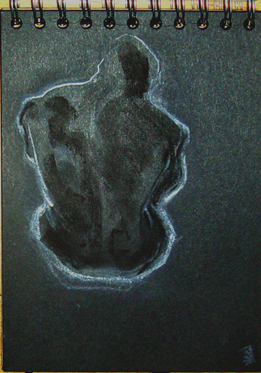
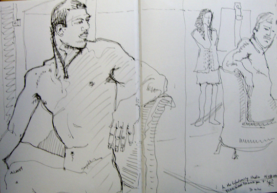
I deplore the ageism that seems endemic in British culture and I address this in my art by using elder models in a lot of my work. We have two brilliant elder models in our life drawing group in Swansea, one male, one female, who are both retired professionals and art lovers. They’ve been modelling for many years and love it and bring so much experience and humanity to the process. I think it’s fascinating to observe the ageing process in the human body and I think a model in their 70’s is every bit as interesting and beautiful as one in their twenties. We really should grow up as a society and stop being so obsessed with the blandness of youth.


This is a large life drawing done into an A2 brown paper sketch book with white, black and sanguine conté crayons.

On The Other Hand….

Charcoal and pastel: Left Hand Drawing.

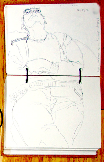
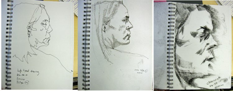
I draw everyday. It underpins my professional practice. Sometimes I go on courses to be shaken out of my complacency because it’s too easy to stay in your comfort zone and not take any risks. This means that you don’t develop. I’ve been working with a very good drawing teacher at a local college and she encourages artists to regularly draw with the ‘other’ hand, in my case it’s the left. I’ve produced some drawings I’ve been very pleased with using this method. It’s a bit weird. For a start, your ‘normal’ hand and arm are used to the exercise you’re giving them; your other hand isn’t and it’s pretty tough at first when you realise just how much effort drawing at an easel is and how much strain it puts on unfamiliar muscles.

You’re also using the ‘other’ side of your brain so the way you observe and interpret what you’re seeing is different. I find it easier to set the model within the space when I’m drawing with my ‘other’ hand, although the line is more wobbly because I don’t have such a good level of muscle control. I guess I’m using the side of my brain that governs spatial things – that’s about the limit of my scientific knowledge!

This is a large easel drawing in charcoal and chalky pastels onto sugar paper. I found it much easier than normal to get the proportions right and to do tricky bits like the hand.


Shadow Of A Skeleton

Shadow of a skeleton.

The sun came streaming through my studio window yesterday and cast this shadow of Felicity the skeleton onto the door.  There’s a work in progress on the easel, a scaled up drawing from a life study in one of my sketchbooks. It’s in charcoal and pastels onto Somerset paper that has been previously coloured with a mixture of acrylic paint, acrylic medium and metallic powder. The model is a young soldier and I’m making a series of work based on him. Eventually I’ll also use this pose for a full-colour monotype. To the left of the easel are two more life drawings that will also be worked up into monotypes at some time.

Sometimes Less Is More

Pastel drawing: female figure.


One of the hardest things in creating a work of art is knowing when to stop. It’s too easy to keep on going and overwork something which then loses its spontaneity and liveliness. I find it useful to do formal drawing exercises to try and overcome this; things like speed sketching, drawing with a twig and ink [really frustrating], drawing with your ‘other’ hand.

This drawing was done in seconds using a square section chalky pastel into a hardbound A4 sketchbook. I used the pastel on it’s side rather than the sharp point so that I wouldn’t be able to get any fine detail, which freed me up to concentrate on getting a flowing motion across the paper and blocking in the main areas and proportions. It’s very free and simple but I think it is also very clearly a female figure. Whenever I find myself struggling with a major piece of artwork and fretting about whether it needs more detail, I do a few simple exercises like this one and it sorts of reboots me and helps me look at my work with fresh eyes.

The Alien in My Right Foot

Today I saw the chiropodist about the verrucae in my right foot and was transfixed for half an hour by his scientific lecture on the phenomenon of veruccae and viral infections. Turned out he did his dissertation on verrucae, luckily for me. I’ve had two on my right foot for some weeks now and my beast of an immune system has been fighting off the viral infection that causes them and giving me quite a bit of gyp along the way. It’s one of the many variants of the human papilloma virus. Apparently viruses are not strictly speaking living organisms as they only have four out of the seven criteria that denote life and the strain that causes verrucae are very clever at hiding themselves from adult immune systems so my own system has done well to seek them out and attempt to destroy them.


Ink and graphite drawing.


The first one died last week. I gave it a tug and out came a – thing – the size of a Jelly Tot. It was awesome. The second one is still in there but it’s on its last legs and should be dead soon. I feel like I’ve been invaded by an alien entity. It’s quite horrible. And it’s stopped me from running; for the first couple of weeks I could barely walk because it was so painful. Anyway, my poor old foot is on the mend so I thought I’d cheer it up by drawing its portrait this morning against the backdrop of my be-socked left foot. It’s all cwtched up with padding and plaster to ease the pain when I walk. It was fun observing how the round spots on the sock are distorted and drawing them accurately.

The drawing is in Faber Castell Pitt pens, sizes S, F, M and B with additional shading in FCP greytone pens and 6B graphite block into a Daler Rowney A6 sketchbook.

Enter Rocky The Dragon and The Suicide Method.

Reduction Lino Print: Rocky The Bearded Dragon.


This is a very geeky blog today. I was chatting to some printmakers on LinkedIn earlier about the ‘suicide’ method of block printing [we love talking technique], where you produce a multi-coloured print using the same block, by progressively cutting away each colour. You end up totally destroying the block, so there’s little room for error and there’s no chance of ever doing a reprinted edition. I started this reduction lino block of family pet Rocky, a bearded dragon, by putting a digital photo through the Artistic: Cutout filter on Adobe Photoshop and printing out an image to the size of the block I was using. I also reversed the image and after transferring it, cut out the fragments of white and printed a pale orangey-yellow. Next I removed the orangey-yellow areas and overprinted in a Rhodamine Red mixed with white to give a rich pink. I use Intaglio Printmakers Oil Relief inks. I printed wet on wet to get a slightly ‘fizzy’ surface texture and to encourage some slight colour mixing. Then I removed the pink areaas and printed a rich brown, then grey and finally black. Lots of work! I ended up with an edition of 18 perfect prints, each about 15cms x 10cms.  He’s a real cuteypie.