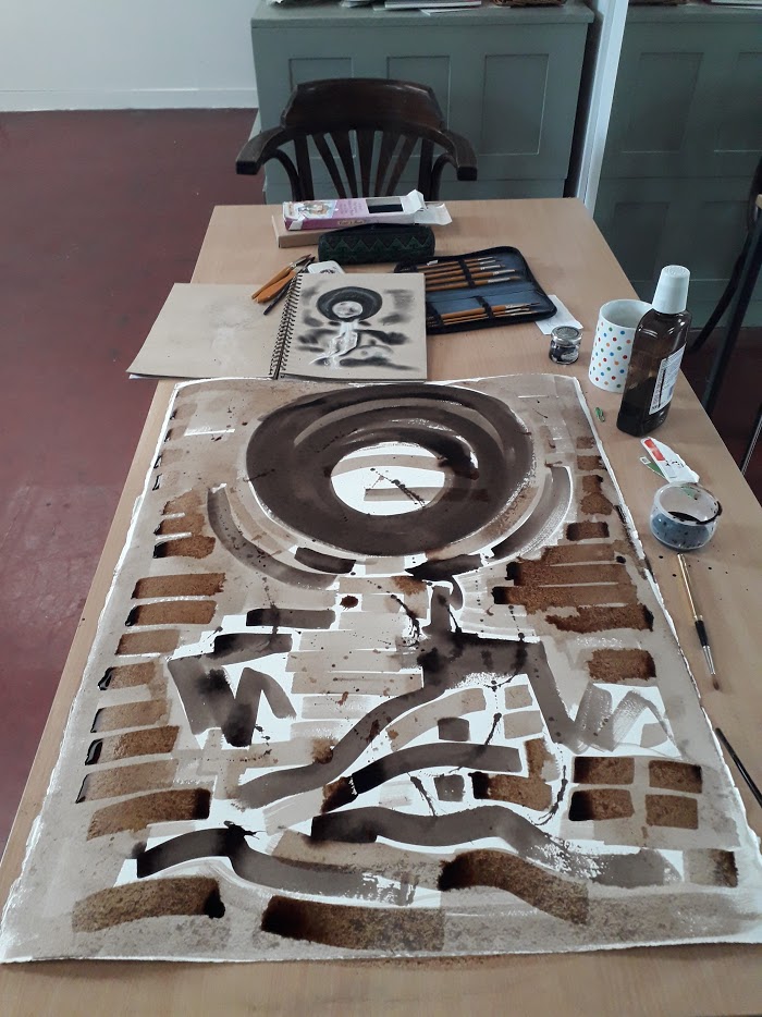

I did some development work today, using one of the drawings I did en plein air on a recent field trip with colleagues from Swansea University’s FIRE Laboratory. I sketched some culverts up in the Brecon Beacons, near the source of the River Tawe and today I worked on a very large piece of vintage Waterford paper with my own home-made walnut ink and some Isabey brushes.
The paper is lovely, very thick with deckle edges and the ink glides across its surface like rich sepia liquid silk. I used the ink neat and watered down into a mid-brown wash and I also splashed ink across the surface. I’ll leave it a couple of days then decide how I want to proceed – do I use colour or not? Or should I put in some darker tones with Indian Ink?

It’s looking pretty good so far. It’s already strong graphically speaking (photos are a good way to ‘stand back’ and look). Darker inks sounds like a good approach.
Thanks Leonie. I think I’ll try mixing Indian ink with the walnut ink, on a different piece of paper, and see what happens 🙂
That sounds like a plan.😀