One From The Archives 8: The Mirrors

The Mirrors
The Mirrors

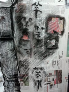
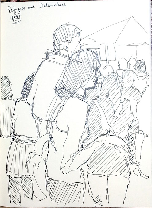
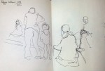
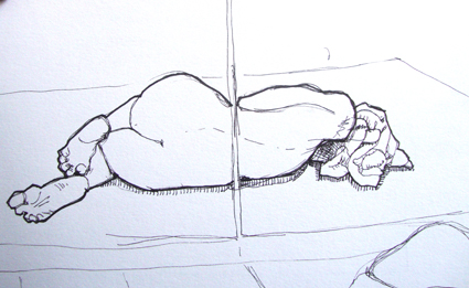
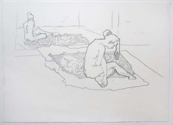
I like this style because it allows me to pick out the most essential aspects of a scene.  The drawing style I use most is the ‘continuous line’ method, where I keep the pen on the paper without taking a break and restarting in another part of the drawing. I also hardly look at the paper at all.

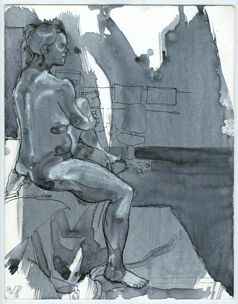
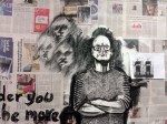
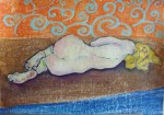
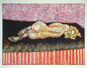
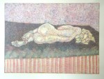
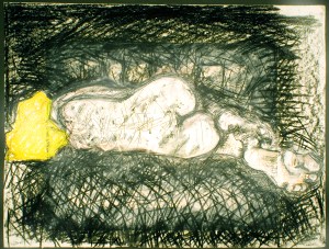
That method of drawing lends itself particularly well to direct line monotypes. A detailed description of which can be found here.   In this monotype I have taken a very busy and colourful life drawing and focussed in on the emotional centre of the piece; a woman lost in her thoughts, seemingly alone.

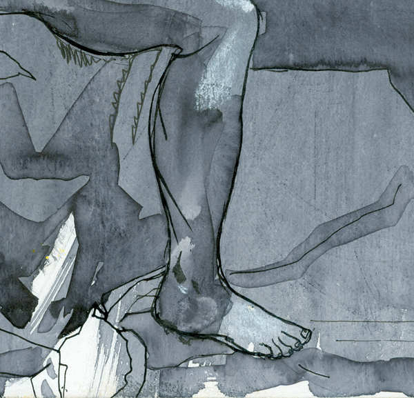
By outlining the woman and her reflection boldly, I hope to draw the gaze to the hard exterior we all sometimes show to the world. Individual limbs and even her face are softer; more delicate and almost blend in with the background. The image shouts “leave me alone” in a way that the more colourful original never could.


Fairy girl double
Fairy girl double

If you want to find out more technical details about the printmaking techniques I use please click here to go through to the technical section on my website. The drawing “The Mirrors” is available for sale on Artfinder and if you’d like to find out more, please click on the link here to go directly to it or click on the link on the right hand side of this blog to see other works for sale.

Heston And Husb

wall g

I’m carrying on with the ephemeral  wall drawing I’m doing down at The Bagpuss Window, the pop-up artspace in a shop about to be demolished in Swansea’s High Street. The drawing will be demolished at the same time. I wrote some text, “The older you get, the more dead people you know” and this is inspiring the whole piece. I’m using charcoal, chalk and conte crayon.

The door has been open and people pop in for a look. One chap came in and asked why I was drawing “….that telly chef, Heston Blumenthal“. It’s Husb! Same hairstyle though 🙂


One From The Archives 7: Rinascere #7

Rin 7 for WP

The pose a model strikes can lend a lot to a piece of work. It is one of the reasons I work from life as much as I do. When I look at this, I see a person who is relaxed and confident as she sits in contemplation of her future. I might be reading that into the pose but our body language says a lot about us and when making decisions about how to represent someone artistically, it can often be the dominant feature.

The difficult part is creating an atmosphere in the rest of the drawing which enhances it. Here I have given the fabric she is sitting on a bright, chequered pattern. This allows me to use the full range of tones to lift the mood of the piece. Browns and blacks are not naturally uplifting shades but using the checks gives me the ability to introduce a bit of lightness into the work without the seat dominating the composition at the expense of the figure.

To the same end, the wash fades to white towards the top of the frame to reveal her head and shoulders as if they were in a pool of light.

If you want to find out more technical details about the drawing materials and papers I use please click here to go through to the technical section on my website. The drawing “Rinascere #7” is available for sale on Artfinder and if you’d like to find out more, please click on the link here to go directly to it or click on the link on the right hand side of this blog to see other works for sale.

One From The Archives 6: Straight Ahead

Straight Ahead

I like to work with a range of models and this middle aged woman is one of my favourites. She exudes confidence and is so comfortable in her own skin.

I draw from life weekly at Swansea Print Workshop, working with professional artists and models. This underpins my artistic practice and inspires me to develop the images into other genres – printmaking, mixed media, painting and intuitive drawing. Models do it for all sorts of reasons, but they all have one thing in common, they love art and engage with art by inspiring artists.

A big part of life drawing is simply the opportunity to practice technique. This can be the technique of drawing itself, where  the actual pose of the model is important. Things like foreshortening can be tricky, as can hands and feet. In fact, the expression “It costs an arm and a leg” comes from centuries ago when rich people commissioned artists to paint their portrait. There was a basic rate just for a head and shoulders portrait. An arm was extra. A leg cost even more. I talked about this in an earlier blog which you can see here.

Then there are the techniques to do with rendering surfaces and textures like skin fabric and flat areas. These will change according to what medium you are using.  Here I was using Faber Castell Pitt drawing pens and ink washes onto mounting (matte) board highlighted with white conte crayon.

Straight Ahead detail for WordPress


Because I like to draw the  room as well as the model I get plenty of scope to practice these techniques.  In this detail, you can see how the washes allow me to render the fabric and the skin in a very free way. The pen work lets me give the figure a sense of weight, using thicker lines and also to convey distance by sketching in background objects more faintly.

If you want to find out more technical details about the drawing materials and papers I use please click here to go through to the technical section on my website. The drawing “Straight Ahead” is available for sale on Artfinder and if you’d like to find out more, please click on the link here to go directly to it or click on the link on the right hand side of this blog to see other works for sale.


One From The Archives 5: The Warrior Prone

SONY DSC
Full colour reduction monotype

I did a small series of full colour reduction monotypes a few years ago, working with a young soldier I know who is also a life model when he’s on leave. He loves modelling and he’s really good at it. From an artist’s perspective, it’s fascinating to work with a man in the prime of life who is in the best possible physical condition, not overdone like a body builder but as fit as it’s possible for a human male to be.

But apart from that, what resonated with me is the danger of his job. He loves what he does, which is difficult for me as I abhor war, but I also accept that some humans are born to be warriors and this man is one of them. And he is a son and a grandson and a brother, as human as the rest of us. All my monotypes are based on original life drawings. I do many in my sketchbooks but only a few make it through to development into something else – a monotype, etching, screenprint, painting etc… When I chose the drawings to develop for the ‘Warrior’ mini-series, I focused on my own feelings and showed the vulnerability of the model. Warrior he may be, but he’s also fragile flesh and bone and his life could be snuffed out so easily.

Warrior prone small
The original drawing, charcoal into an A3 sketchbook


The full-colour reduction monotype process produces one piece with deep, jewel-like colours but I also put another piece of the gorgeous BFK Rives paper through the antique etching press at Swansea Print Workshop to take a second – ghost – impression. This technique was beloved by Impressionist artists Degas and Monet and they often worked over the ghost monotype with oil pastels. But often, the untouched image is quite beautiful without any more work, the oil pigments break up slightly like an Impressionist painting.

The 'ghost' Warrior Prone
The ‘ghost’ Warrior Prone

If you want to find out more technical details about monotypes, please click here to go through to the technical section on my website. The “Warrior Prone” is available for sale on Artfinder and if you’d like to find out more, please click on the link here to go directly to it or click on the link on the right hand side of this blog to see other works for sale.


The Eye Wild

News of a fab exhibition coming up at Swansea Print Workshop

drawntoprint's avatar15 Years, people and printmaking

A DATE FOR THE DIARY:

The Eye Wild |An exhibition of original prints by Carol Lawrence and Bridget Stevens | Daily 25 -27 September, 11.30 to 4.00 | FREE

where does an idea come from? where does it go? marks on paper from an inner world made visible. Artists Carol Lawrence and Bridget Stevens explore the inner landscape and respond to poetry and myth through printmaking

WITH SPECIAL EVENT | Hear the poems read by some of The Poets, let your eye range wild and see where it takes you. Join us for a Tea Party where Print Meets Poetry meets Cake Sunday 27 September 2015 2.30 – 4.00 pm |FREE

View original post

On The Move

refugee 1

Husb and I went to the gathering in support of refugees in the centre of Swansea this afternoon. There was a good turnout and I took the opportunity to have a few scribbles. Drawing in crowds is hard; people don’t stay still. You fix on one figure as your starting point but before you finish, they’ve moved! It’s like drawing pigeons, they move constantly. So it’s good practice for me, but very frustrating.

Can’t See For Looking!

 4


Sometimes you can’t see the wood for the trees. I’ve made a start on a wall drawing onto newspaper, working from a photograph and it’s only now that I’ve put the photos onto the computer that I can see that the legs are too short! I could NOT see that when I was doing it. Leonardo da Vinci recommends checking your work in a mirror regularly because it helps to spot the wrong bits. I’ll have to take his feet down over the skirting board.

I’m working in an old shop in the centre of Swansea; it’s on loan until it gets demolished and I’m there with some other artists; we’re using as a pop-up artist’s studio. I papered the wall with newspaper and blocked some basic figures in white emulsion. I like working onto newspaper, I can incorporate images and headings into the work. I also like the texture of the charcoal on top of the brushstrokes and the wrinkles in the newspaper. I’ll be carrying on for a couple of weeks and when the demolition crew moves in, it’ll all be knocked down to make way for urban regeneration.

If you’re on Facebook, you can find out more about our temporary artspace here.

One From The Archives :4 The Name Game

The Towel

Drawing is the basis of everything I do. Sometimes it can be the finished product itself but more often it is the starting point for work in many different media.

towel small

Once I decide that a rough sketch is worth developing, I like to see how many different ways I can expand the idea.

This is a very small scribble I made in a life drawing session a couple of years ago in a sketchbook size A5. I drew the reflection of the model in a mirror.

yellow towel small
Curlicue

I developed this into a painting (size A3). I don’t often paint but I wanted to do some technical exercises with oils. This allowed me to play with colour and pattern to create a mood around the form, which led to the title, Curlicue. Finding names for pieces is always hard, in my experience.

yellow towel final small
Yellow Towel

I then scaled up the drawing and used it as the basis for a full colour monotype, along with it’s ‘ghost’ below. I concentrated on developing a denser background and the complexities of skin tones.

yellow towel ghost small
The Pale Yellow Towel

The richness and subtlety of the colours in this technique give a very detailed surface that is endlessly fascinating. These two, Yellow Towel and The Pale Yellow Towel are larger again, A2 size. See the problems I have with naming?

When you have the basic drawing, you can also change things around and have some fun; make it darker and more brooding by using a wider variety of drawing materials or even viewpoints.  You can let your imagination and the lines run riot, like this one I’ve called Black And Yellow. I wonder if there’s a ‘Naming Art Tutorial’ somewhere on the Internet?

Black and Yellow
Black And Yellow

And finally, back to A5 and a photopolymer plate etching (below). Here I can go back to basics with the human form but transform the background into a luxurious tapestry. I called this The Towel. I know. I know.

24 towel
The Towel

I wonder where I’ll go next with it? The possibilities are as endless as the techniques available.

It would be lovely if you’d follow me on Artfinder. If you want to, please follow the link below.

follow-artist.9a5fd425d326


One From The Archives :3

The Blanket

Another one from the archives; this time an etching.  I’ve been incorporating text into my drawings and mixed media work for some time, but it’s much harder to do so with most printmaking techniques because you have to work back to front. Luckily, the photopolymer method allows you to do this without the fear of getting it wrong.

Blanket

The luxurious sensuality of the surroundings in this image contrast with the stark and simple portrayal of the human form. This is an etching of one of the nude models I work with and is developed from a study drawn with Renaissance materials, inspired by artwork I did for a television series about da Vinci.

For the print geeks out there, this is s photopolymer steel plate etching, hand-printed using oil pigment onto BFK Rives cotton rag paper.

You can see more about the techniques in an earlier blog here.

If you would like to own this drawing is it available from Artfinder.

AF logo

To see more work on Artfinder please follow the link below.

follow-artist.9a5fd425d326