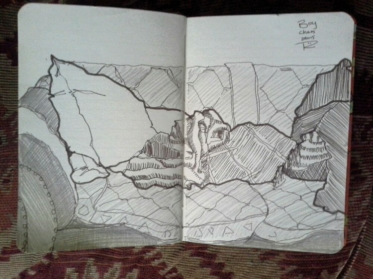
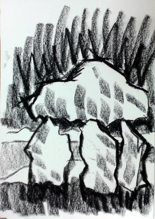
I started working on a new tiny drypoint. During my residency in Pakistan last year, I did a fair bit of sketchbook drawings and I spotted this carved elephant in a restaurant in Lahore. I scribbled it and I’ve now redrawn it, with a Faber Castell Pitt drawing pen, onto a small piece of drypoint card (available from Intaglio Printmakers).
I used a drypoint tool to incise the lines, making sure that the tool cut through the plastic coating. It’s now ready for printing. That’ll come tomorrow.
Sleep. Dream. Nightmare. This is an etching of one of the female models I work with and is developed from a nude study drawn with Renaissance materials, inspired by artwork I did for a television series about da Vinci. One of my initial drawings can be seen below.
For the etching, I worked on the drawing, using nib pen, Indian ink, ink wash and black oilbar onto transparent film. You can see this and other prepared drawings in my previous blog here. From these, I was able to make photopolymer plates which I used to produce etchings. You can see a detailed description of how I produced the etchings here.
Each etching is hand-printed by me using oil pigment onto BFK Rives cotton rag paper
Rinascere #13
I draw every day and don’t know what I would do if I couldn’t. Describing very specific aspects of the world and more to the point, the people in it, helps me to stamp my own vision on my surroundings.
Each drawing is an exploration of that vision, which means I can tackle the same subject in many different ways. Using different media means I can go even deeper into a subject and tease out threads of meaning I perhaps wasn’t initially aware of.
This drawing is in Indian ink using a traditional dip pen is on handmade paper, prepared with black and sepia ink washes.
The etching, ‘The Gathering’ and the drawing, Rinascere #13 are available for sale on Artfinder and if you’d like to find out more, please click on the links here and here to go directly to them or click on the top right of this page to see other works for sale.
Today is the Autumn Equinox and The Bagpuss Window featured a labyrinth made from bark and gong music from David Pitt. Visitors were invited to walk the labyrinth while David played gong. I had a go. It’s very meditative. It helped me loosen up as I did some more work on my big wall drawing.
Walking the labyrinth with David Pitt on gongs
I’m loving what’s happening at The Bagpuss Window. When I picked up the keys to the old shop at the beginning of the month, I had no idea so many lovely artists would get involved. It’s been a brilliant experience.
This is one of a short series of female nudes I did, based loosely on the concept of Eve and apples. It is a full-colour monotype, which is a unique artwork that uses a process beloved by the Impressionists, especially Degas and Monet. A full explanation of the technique can be found here.
As with all of my nudes it is based on a life drawing which can then be used to produce work in many different media. The full colour monotype allows me to explore the surface texture of the paper, the figure and background with a massive range of hues to produce a piece of work which is seductive in its richness.
For all the print geeks out there I used oil-based litho/relief pigment onto BFK Rives cotton-rag paper
The Dreamer
The direct line monotype is a quicker, more intuitive process that lets me sketch in the basic figure and let the imagination of the observer fill in the details. Like the full colour monotype, this technique also produces only one work. I like to think that here is a woman, lost in reverie, as she relaxes, comfortable in her own space.
An earlier blog of mine details the process and pitfalls and can be seen here. For this I used archival quality oil-based litho ink onto Zerkall paper
The monotypes; Eve Imagines Big Apple Crumble and The Dreamer are available for sale on Artfinder and if you’d like to find out more, please click on the links here and here to go directly to them or click on the top right of this page to see other works for sale.
I’ve finally finished the piece I’ve been working on for the exhibition ‘A Victorian Tapestri’ at the end of this week. It’s constructed of the 12 pieces that make up a Victorian corset, cut from a heavyweight Somerset paper. I coated each with cyanotype chemicals and printed them with some of my sketchbook drawings. I’ve called it ‘Constrained’ because it reflects the physical and social constraints endured by Victorian women. The cyanotype process was invented in Victorian times by Sir John Herschel, one of the earliest of photographic processes. I’ve tied the pieces together with mauve ribbon. The aniline dye Mauve was invented by the Victorian chemist William Perkin in 1856.
I decided on a corset when I saw the brief for the show, “all kinds of archaeological, historical, metaphorical, and allegorical excavations of Swansea’s Victorian heritage.” I have vivid memories of my Mam taking me to a corsetry shop called Madam Foner’s in Swansea’s High Street to be fitted for brassieres when I was in my early teens. She believed in ‘proper’ underwear and wouldn’t let me have those flimsy, pretty department store bras that my schoolfriends wore. So I had to endure an adolescence of engineered constructions that looked like they’d been built in a shipyard. The Victorian connection? Madam Foner’s was in a beautiful Victorian shop, now housing the rather lovely Galerie Simpson. Click here to see a photo of this gorgeous building.
The exhibition opens this Friday at Tapestri on Alexandra Road, Swansea at 7pm and runs until October the 9th.
Variations on the themes of tattoos and flowers. I love working with this model. Older women are often invisible in our society. She is an elder and voluptuous and larger-than-life and covered with tattoos. Some of them are carnivorous plants engulfing insects across her body. She is confident in her own skin and first featured in my blog in August 2012 and again in April 2013, when I produced an etching from the drawing.
The first drawing is in Indian ink using a traditional dip pen is on handmade paper, prepared with black and sepia ink washes. For that drawing I focussed in on an orchid tattoo, lifting it off her body to place it on the drapery underneath her and the wall behind her.
In this second drawing I wanted to feature both her and the pitcher plant tattoo on her arm. I like to recycle materials, especially papers and mounting boards and I prepared this piece with an ink wash, sponged randomly across it before I began to draw. I used Faber Castell Pitt drawing pens, ink wash, black and white conté crayon onto mounting (matte) board.
I was able to use the wash to further develop the theme of the flower in the background. Here it is more integral to the background and seems to emerge, organically; as if from the shadows. Her face, deep in thought, is part of the same broad area of wash which make the pitcher plant look like the product of a dream, reminiscent of the Goya etching ‘The Sleep of Reason Produces Monsters’.
If you want to find out more technical details about techniques I use please clickhere to go through to the technical section on my website. The drawings, Rinascere #6 and The Flower are available for sale on Artfinder and if you’d like to find out more, please click on the links here and here to go directly to them or click on the link below to see other works for sale.
I did a whole load of cyanotypes yesterday for an exhibition and I had some pieces of paper and chemicals left over so, waste not want not, I coated the paper scraps and stored them away in a folder in a dark cupboard. Today, I shrank my negatives digitally and printed them out on acetate. We had a brief respite in the rain with some truly brilliant sunshine for a couple of hours around lunchtime so I put a drawing board onto the floor with the back door open, put the coated paper face up on it, placed the little negs onto the paper and a sheet of glass on top to keep them still.
They only take 6 minutes in the UV Unit at Swansea Print Workshop, but I had to take an educated guess for today’s exposure. I left them for 22 minutes, checking regularly. I could see the cyanotype chemicals changing colour around the edges of the negatives. You can see the undeveloped images in the top photo. I removed the negs and rushed the little prints off to the kitchen sink and washed them gently in cold, running water for 20 minutes. Here they are above in the washing up bowl. I drained them and they’re now being pressed between boards and tissue paper to dry flat. I’m really pleased with the result. It’s a way of using my sketchbook drawings.
I think I might put these onto Artfinder tomorrow.
Here you can see the original (below) and the finished painting (above). I usually have no idea how I will be using the original life drawing when I first get it down on paper. At that point it is often just a case of describing what I see in front of me using line and shade.
Often I will combine the figure drawing with other sketches from incredibly diverse sources. In this case a poster for a rock band and remembering those teenage crushes on pop stars – I LOVED The Monkees – and how so much of my time was spent day dreaming about them. Where did the time come from? Not enough hours in the day now!
As part of my artistic practice, I like to study and build upon my theoretical base. This is one of a series of small oil paintings inspired by re-acquainting myself with Johannes Itten’s colour theories.
Using the theories enables me to work up a full colour painting from monochrome sketches. Not having the distraction of the real colours of the scene allows me to develop paintings so the colours are more harmonious and satisfying to the eye.
If you want to find out more technical details about techniques I use please click here to go through to the technical section on my website. The painting Fan Girl is available for sale on Artfinder here and if you’d like to find out more, please click on the link here to go directly to it or click on the link on the right hand side of this blog to see other works for sale.
A while back I began a new piece of artwork, quite an ambitious one using some of my sketchbook drawings of older women and a Victorian corset pattern to create a 3D piece in cyanotype, an archaic photographic technique. I cut the pieces from some lovely Somerset Velvet paper, 12 in all, and scanned and printed some of my drawings onto sheets of acetate (after reversing them in Photoshop so they are negatives). Yesterday, I coated the pieces of Somerset with the cyanotype chemicals and put them to dry overnight in a lightproof cupboard. And today I took them to Swansea Print Workshop to develop them in the UV Unit.
After exposing them for 6 minutes, I washed them face down to start the developing process then turned them over – you never know if it’s worked until this point. I’m delighted with them. They were drained for 10 minutes then I put them between sheets of tissue paper between low-density fibre drying boards.
Next step is to assemble them and get them ready for the exhibition. More about that tomorrow……..
Here I am drawing while David Pitt plays gong at The Bagpuss Window on Swansea’s High Street. Just a very short video showing the manky old shop when we got it and the still quite manky artspace it is now. It’s being knocked down in a few weeks so everything we do in there is ephemeral, it will eventually only exist in our photos and videos.
As well as the huge drawing on the wall, I’ve been getting into making little tableaux in the window. This one features tiny handmade books by Bud Francis and drawings by me.
And in this one, Robodog Ralph shows Bagpuss how to paint (it’s actually by Tim Swain. AI isn’t that good yet. Not round here anyway).