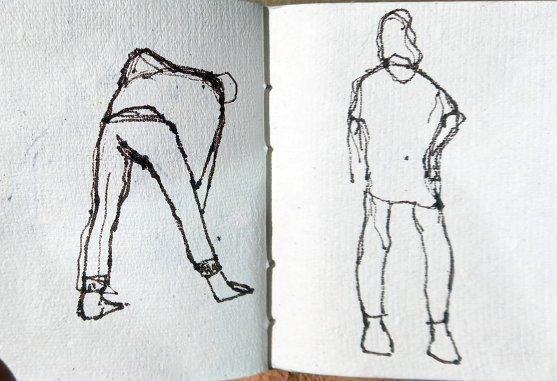
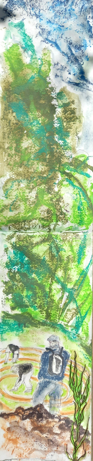
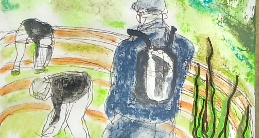
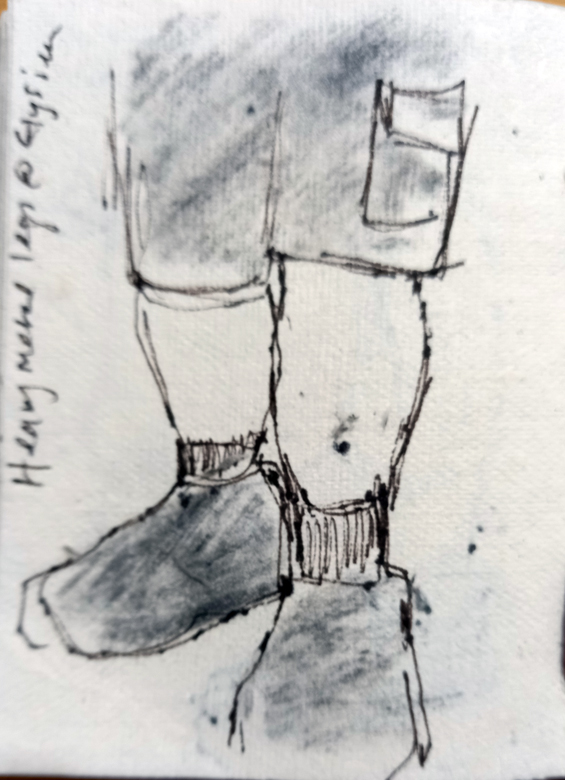
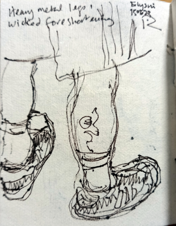
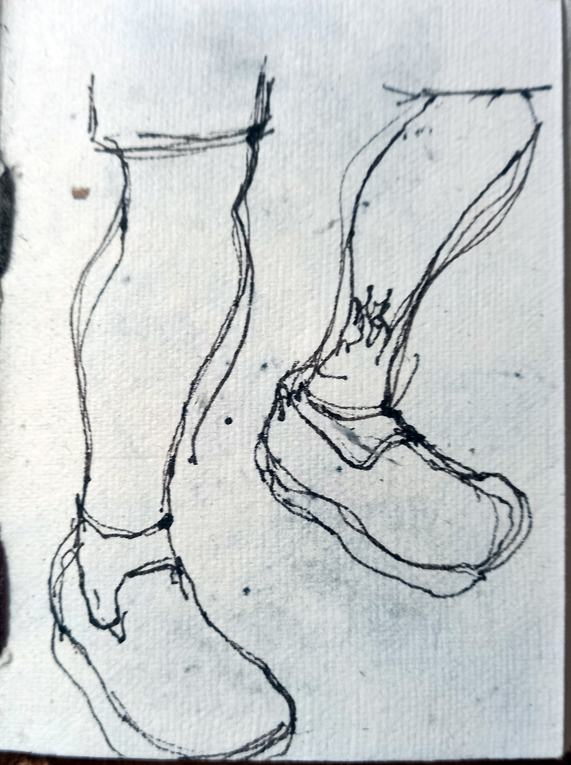
Here’s another sketch I did on holiday in Porto, Portugal last week. It was very hot (for me anyway) and Husb and I took refuge in the beautiful Crystal Palace garden near our little hotel. There was loads to sketch there but I settled on this view of an old statue, probably 19th century, in front of a very modern building across the road. I scribbled it with a Faber Castell Pitt drawing pen, size S first, then added in some colour washes with Derwent Inktense blocks.
Strange Trees In The Dark.
I was so taken with the odd pollards in the Porto park, Jardim da Cordoaria, that I went back the next evening with my landscape Khadi sketchbook and Derwent Inktense blocks and spent a while drawing the strange trees in a mix of natural night-time darkness and harsh orange/yellow street lighting.
Pollards In A Park In Porto
Husb and I went away for a few days, which is why I haven’t blogged recently. It’s our first trip outside the UK since before Covid19 and to be honest I was nervous, but we met up with family from different parts of the world in Porto in Portugal and it was so lovely. The city is wonderful and I became fascinated with these pollarded Platanus Gigantus, I haven’t seen pollarding like this before, in a park near our hotel, Jardim da Cordoaria. I sat and sketched with a Faber Castell Pitt drawing pen and a stick of charcoal into a very small pocket sketchbook.
Going To A New Home….
Another Head.
At the gig.
Let The Water Do The Work.
Here’s another little watercolour from my adult teaching session this week. I’ve been emphasising that the important thing about watercolours is actually the water, letting the image develop as it dries. We flooded the stretched Bockingford paper with clean water then using a very wet brush, “dropped” the wet pigment onto the paper without overworking it. I dropped three grains of sea salt onto this one to concentrate the pigment around them.
Teaching Watercolours – The Reveal
Today was a fun day. Last week’s adult education group prepared some samples of different watercolour effects but they were still wet when they left (below), so today we had the big reveal! It’s always exciting and these techniques often have that WOW factor!
We used Winsor & Newton Cotman half pans onto Bockingford watercolour paper. We stretched the paper first onto boards and used masking tape to define the separate spaces.
Setting The Type.
I spent a happy couple of hours at Swansea Print Workshop this afternoon, experimenting with the vintage wooden typefaces to design my next little experiment in letterpress. I had more or less settled on this one but then I couldn’t find any quoins to hold it together, so I’ll have to go back to finish it. Never mind, it’s good to have time to play with stuff and see what happens.
Playing With New Toy.
My new toy came through the post today, a box of Caran d’Ache Neo-Pastel colours. For a long time now I’ve been following the blog of USA based artist Aletha Kuschan and I’ve been so impressed by her work, particularly her lovely vibrant pastel drawings. She kindly told me what she used for them. So I had to have some. I did a very quick scribble onto Khadi handmade paper. I love the colours, the juicy intensity and the feel of the pastel as it glides over the surface. But I’m not keen on the way it moved over the very thick paper. Back to the drawing board (hahaha)


