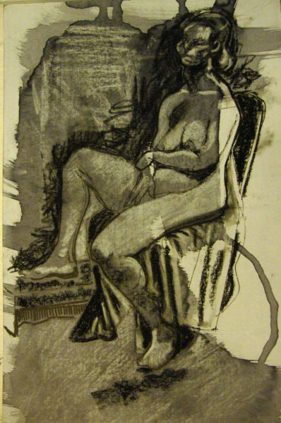
This model gazes at the viewer, completely at ease and totally confident in her own skin.

Most life models are by nature, confident about their bodies and have no problem with being looked at. It is their job after all. Usually though, they tend to look away from the artists. On a purely practical level his is because there will be a number of artists in a life drawing setting and the model cannot look at all of them.
In this work I have chosen to capture the gaze of the model, which gives her more of a relationship with the viewer. She is looking out, as if to engage with anyone who looks back. Although she is naked, it is her eyes and face that draw you in.
I have rendered the rest of the figure in a minimalist fashion to emphasise where the important part of the image is. She is as curious about you as you are about her.
The technique, known as direct line monotype produces a unique artwork in the style of a line drawing. I used archival quality oil-based litho ink onto Zerkall paper.
If you want to find out more technical details about techniques I use please click here to go through to the technical section.
The monotype “The Gaze” is available for sale on Artfinder and if you’d like to find out more, please click on the link here to go directly to it or click on the top right of this page to see other works for sale.


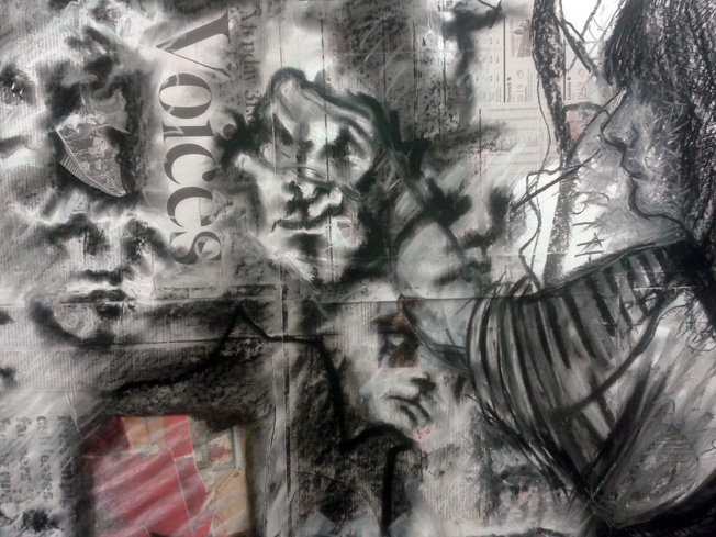
![Oil on canvas: Purple Hair [detail]](https://scribblah.co.uk/wp-content/uploads/2011/11/purple-hair-detail.jpg)