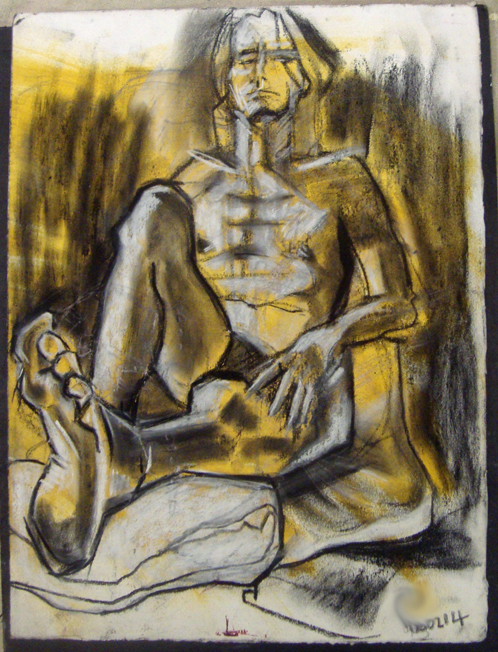
I use top quality art paper in my work and I like to recycle my own and other people’s cast offs. Here’s a piece of Somerset I found in the waste bin at the print studio. It had been prepared with cyanotype chemicals but not used. It’s been hanging around in a draw for a couple of years, waiting for a subject to present itself. I had it in my bag at life drawing last week and it suited this 10 minute pose. The model was reflected in the mirror and the vertical drawings fit the large upright blocks of dark blue. I used black Indian ink with a traditional dip pen which is smudgy and blotchy, like the cyanotype.
After Piero di Cosimo
It’s day 10 of the Facebook February daily drawing challenge and I’m posting this. I’ve just drawn it on my Samsung Galaxy Tablet using the free Markers app. I started out by laying down a background colour – if you don’t it goes weird when you save it and does a funny sort of negative thing. Then I added splodges and spots of texture with the translucent tool in greys and white. The background texturing is similar to the abstract patterns in many examples of European Paleolithic cave art.
The drawing is a study made after Piero di Cosimo from my book of Renaissance drawing. I’ve been wanting to do a bit of academic practice lately and the drawing challenge is a good way of spending a few minutes a day studying some of the greats. I’ve enjoyed drawing this fragment of landscape. I’m not a big fan of landscape drawing but this is giving me a handle on it. So thanks, Piero.
Looking At Leonardo
It’s been a busy weekend with our two 9 year old nephews staying over and a lengthy business meeting ths afternoon. Yes it’s a Sunday but I’m freelance so I don’t work regular hours. But I try to do a drawing a day for practice and discipline and I’ve been dipping into my Renaissance drawing book by Hugo Chapman and Marzia Faietti. I spent a few minutes with my Faber Castell Pitt drawing pen, size F and my A5 clothbound sketchbook working from this da Vinci sketch.
It’s interesting to draw from another artist because you can appreciate their technique. While I was sketching this, I realised how sparse the linework is; how much is filled in by the viewer. I also realised, although I’d looked at the original many times, that he drew the head slightly too large. I don’t know if that was deliberate or perhaps the model was like that. Apparently, film stars with slightly larger heads look better on the big screen than those with ‘normal’ heads.
Day 8: Fast Face
Been busy all day having fun with 2 little nephews having a sleepover so just managed a very quick digital sketch of a face from my Renaissance Drawing book by Hugo Chapman. Did it in about 4 minutes on my Samsung Galaxy Tablet with a free Marker app. You have to lay down a background before doing the drawing otherwise it saves as a negative, which is a pain in the neck. Took me quite a while to work out what the problem was. Spent a big part of today cooking because it is SHOCKING how much two nine-year old boys can eat!
Foetal!
Here’s another one from last night’s life drawing session at Swansea Print Workshop. I love drawing models in a foetal position. There’s a terrific tension and movement in the pose as well as some great foreshortening. I precoloured a canvas sheet, size A3, with Rodamine Red oil pigment, squeegeed on with a cheap window-cleaning squeegee and left to dry. I did the initial drawing with a white conte crayon, drawn over with black conte and then rubbed some cerulean blue oilbar onto it. It’s a long way from finished but it was only a 30 minute pose and the basics are there for me to build upon.
Indulging Myself
Just back from life drawing at Swansea Print Workshop. I really like this model because he’s as thin as Egon Schiele’s models and I came all over German Expressionist. We had one of the spotlights on so I was able to indulge myself with some chiaroscuro. I also love extreme foreshortening like this. Great evening 🙂
I drew onto an A3 size canvas sheet that I’d prepared with an acrylic yellow ochre wash. I’d used it previously for drawing but I didn’t like it so I drew this on top. I worked with black and white conte crayons, white oil pastel and a stick of carbon.
Day 5: I Don’t Care!
So continuing with the 28 Drawings After challenge on Facebook and practicing drawing from established artists, I took up with Raphael again. Husb gave me a lovely book on Renaissance drawing from The British Museum that I’ve been meaning to draw from for ages. I’m using the Samsung Galaxy Tablet again with a free Magic marker app. It’s probably very old-fashioned, but I think it’s important for artists to study those who have gone before. I think that’s part of learning the craft in art, although that also seems to be an old-fashioned concept at the moment. Ah well, I don’t care 😀
Day 4: After Raphael
It’s day 4 of the Facebook February drawing challenge and I haven’t been out at all today. The weather’s been awful and I’ve been doing loads of things on computers, so not much of a chance to draw. Husb bought me a lovely book about Raphael for Xmas and as I like to study other artists for practice, I chose this drawing to work from. I used my Samsung Galaxy Tablet with a free Magic Marker app. I like the idea of using 21st century technology to study 16th century Renaissance art. Took about 10 minutes. I think I’d rather work with a traditional dip pen and Indian ink though.
Drawn In The USA
This is my first video. I took some footage during my residency at Wingtip Press in Boise, Idaho last year and edited it with stills of the artwork wthat was produced by the artists I was working with, both there and later in Swansea Print Workshop. It won’t win any Oscars but it’s nice to put up a record of all the hard work that was done and to acknowledge the wonderful artists I had the privilege of being with.
Käthe Kollwitz- The grieving parents
I’m reblogging this because it is a moving and beautifully written blog about Kathe Kollwitz’ sculpture, The Grieving Parents. It’s in a military cemetery in Flanders and I hope to visit it later this year.


