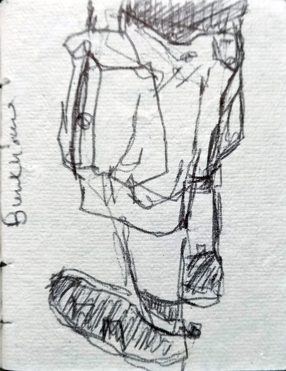
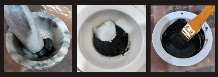
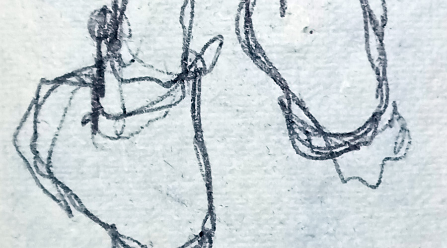
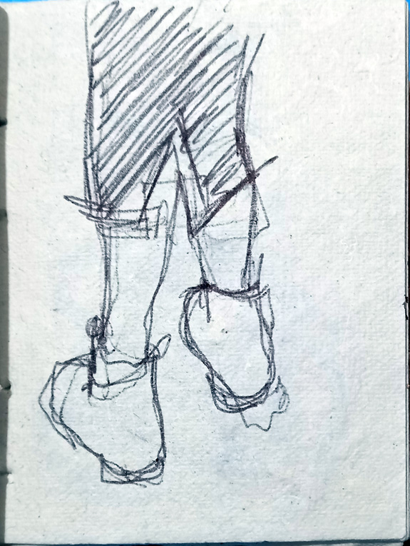
Slapping It On …..

A painting in progress with 7 multi-coloured bottles on a dark background which is blue for the bottom third and purple at the top.
Lots of paint going on.

I carried on with the still life painting I started a couple of weeks ago. I’m really enjoying this, I’m not being precious about it so I can just slap the paint on without stressing about it, impasto style. If I don’t like what I’ve done, I’ll just paint over it. It’s gradually building up into something resembling the original.

I’m using Liquitex Heavy Body acrylic paint onto a canvas board, although I began the painting in Daler Rowney System 3 acrylic ink.

#StandingStoneSunday.

A drawing of the ancient monument Arthur's Stone in shades of white, black, browns and rust colours.
Crazy Marks.

It’s Standing Stone Sunday on social media again and I’ve chosen a strange little drawing I did of a relatively local monument, Maen Ceti (Arthur’s Stone) at Cefn Bryn on the Gower Peninsula. It’s a huge magnificent megalith in beautiful countryside and it’s easy to get distracted and concentrate on the surroundings when I’m drawing or painting. This time I made a conscious decision to do something different and played around with making interesting marks. I started with a piece of paper prepared with gesso and my homemade walnut ink and build on that background with conte crayons in black, white and sanguine.

If you want to see more of my standing stone art, please browse my digital gallery here.

Friday Night at the Patti.

A couple in the dark.

Husb and I went to a gig last night, The Beat at the Patti Pavilion, a beautiful old venue on the seafront that had put on gigs all through the 1970s. Friday nights at the Patti are a fond memory of my youth and I saw some wonderful bands there. The gigs have been resumed after a gap of about 40 years! Of course I had to have a scribble.

A sketch of two people, a man and a woman, leaning into each other to talk at a concert. The figures are very dark and set within a dark room.

Double Vision.

Two words printed in antique letterpress, with shadow letters behind them. The words are printed in two colours using a rainbow roll technique.
Typeface Doubled Up.

I tried this neat trick with the two letterpress pieces I did recently at Swansea Print Workshop. After the first print, I moved the paper slightly and put it back through the press and it picked up the ghost from the remaining ink on the wooden blocks.

Grrrr!!

A typeface form showing the word Grrr in reverse in different sized vintage wooden typefaces has been inked with blue and red, and the print of it is shown on white paper.
Giving It Some GRRRR!!

I played around with Letterpress again at Swansea Print Workshop this week. Last week I did a piece using Intaglio Printmaker’s relief inks and this week tried out Cranfield Caligo Safewash, both times using a rainbow roll. I found little to choose between them, to be honest. The Safewash is slightly runnier and less sticky which gives softer edges but it’s also much easier to clean up.

Mixed typefaces.

I used a combination of different type from the “odds’n’sods” draw, leftover letters that don’t belong anywhere else. I love these vintage and antique wooden blocks, they have so much character, they’ve lived a life and the little nicks and worn bits are so much more interesting to me than brand new perfect ones …. or computer generated.

Darkening the background.

Carrying on with the little still-life painting, I filled in the colours roughly on the bottles and took the background through a mixed pink to dioxazine purple. Once the drawing is in place, this painting seems a bit like colouring-in. I normally stress over making art, but this is very relaxing.

“Pinking” the background.

I started the painting with Daler Rowney System 3 acrylic paints but since bringing it home, I’ve switched to Liquitex Heavy Body acrylic. I’m painting onto a canvas board.

Teaching, Drawing, Painting.

Starting on white.

Last week I taught an introductory adult education session at GS Artists, one of Swansea’s finest. I borrowed a selection of decoupaged bottles for the still life and set them on a plinth in the middle of the group. I chose these instead of clear bottles so we didn’t have to cope with reflections and refractions.

I started with a few drawing warm-ups, continuous line and drawing negative space, then the participants drew onto canvas board and painted with Daler Rowney acrylic paints. I worked along with them so I could demonstrate techniques in real time. I wouldn’t normally work directly onto a white background, but as it was a basic class I decided not to muddy the waters.

Scraping And Sketching.

A painting in progress, mostly dark purple and black with flashes of orange and some areas of white. There are the outlines of four people: three are little more than heads in the foreground, the fourth is the main figure and is in the centre of the canvas.
Sketching the figures.

I finished scraping a layer of Dioxazine Purple (transparent) over the bulk of my nocturne with a palette knife. When it dried, I started to sketch in some figures with Unbleached Titanium (opaque). I’m using Liquitex Heavy Body acrylic paints over a recycled and heavily textured stretched canvas. Still a long way to go ….

A detail of the painting.

#Caturday …

The baleful look.

It’s #Caturday / Saturday again and here she is, Sparta Puss, lounging on a comfy blanket surrounded by cushions. What a life! I put the image through Adobe Photoshop using a Watercolour filter.

Scraping On Another Layer.

On top of a canvas painted orange with some white areas, there are two flat paint brushes, a palette knife and a tube of purple paint. A streak of purple paint lies down the left hand side of the canvas, ready to be spread across the painting.
Getting ready for the next layer….

I carried on with a little bit more of my current painting, a nocturne with a fiery figure. I laid some Dioxazine Purple (translucent) onto the Cadmium Orange (opaque) ground with a palette knife and a couple of flat brushes, scraping it to let some of the orange show through.

A painting in progress with three colours, orange, purple and white so far. The paint is heavily textured as it has been put on with a palette knife.
Laying the paint directly onto the canvas.

I’m using Liquitex Heavy Body acrylic paint onto a stretched, sized canvas.