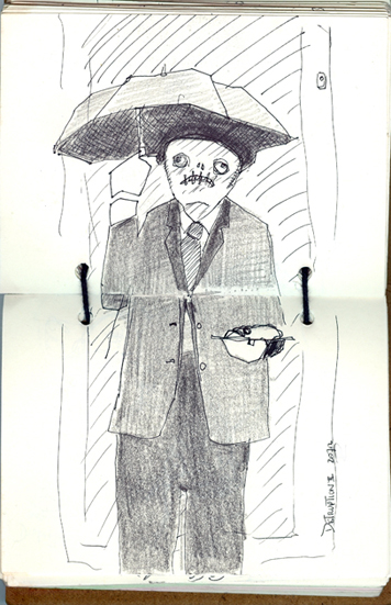
The city centre embraced post apocalyptic weirdness this afternoon with the Disruption II art event drawing crowds of disbelieving onlookers out and about in the uncharacteristic sunshine. Some artists were performers, some recorders. I was recording through drawing, wandering along the street in a rubber army gas mask and tarpaulin [in the blazing sunshine] clutching my sketchbook and speed-drawing the collective madness around me. This is a creature with a hideous face who was sheltering from the sunshine whilst holding a platter bearing a large fish head. It wasn’t the weirdest thing there today. Tomorrow I will reveal the shrieking slug people.
New sketchbook, new sketching
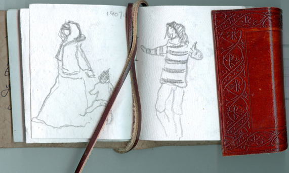
My pal gave me a brand new sketchbook for a present the other day. It’s very tiny and has very rough hand-made paper which isn’t suitable for the usual fineline pens I use so I had to thnk how to use it. i decided to spend 10 minutes each day sitting in the window on the landing of uor studio block, sketching the people moving below with a lump of graphite. Challenging but good discipline. You have to be very quick and identify the most important features of the figures – no time to do any details – you have mere seconds.
New Male Nude [parental guidance]
This continues my small-scale life drawings using Renaissance techniques and materials. Our model sat up high on top of a plans chest and I scrunched my chair quite close, underneath. This gave me a fairly extreme perspective and foreshortening. I deliberately look out for awkward poses because – I’m a masochist? 🙂
I used some hand-made paper stained with a sepia ink wash and drew in Indian ink with a dip pen. I did highlights in white conte crayon and the shadows in ink wash with a small sable brush. The paper is approximately A6 in size. I’m going to the print studio next week to make some new solar plates and this is one of the drawings I’ll be using as a source.
Riot Police the untold story
Terrific blog from a lazy film maker 🙂
Not So Great Dictator Speaks With Words
I started making the Lego Riot Police films a few years ago. I’ve only made five because; well to be honest it’s because I’m lazy and I should pull my finger out. Nevertheless a certain theme has emerged which was not apparent in the first one. That theme being the very nature of existence. Typical sit-com fare.
I hadn’t really sorted out who the characters were or what their world view was in the first one so I concentrated on the minutiae of their life. Me being who I am it was always going to be about food and so doughnuts took centre stage.
Here it is. The mean streets of Britain and the difficult decisions made by hard working police every day as they struggle with the work/strife balance.
Tidy Scran
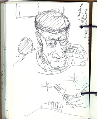
Was a bit busy this morning doing some last minute stuff for this evening’s exhibition [below] so Husb and I went to the Continental Caff for our lunch. It’s what we round here call ‘tidy scran’ which means good, filling, unpretentious home cooking. It’s always full of people having a cooked dinner – traditional British food, nice roast meat, lots of vegetables and proper gravy. Behind Husb there was an elder gentleman tucking into his massive plateful. He had a patterned knitted jumper and he kept his cap on. That’s summerwear in Britain this year 😦
If you’re in the Swansea area, a lovely exhibition of miniature prints opens at Swansea Print Workshop tonight. Come and join us for wine, cake and art from 7pm this evening, exhibition is open daily until August 15th. It isn’t raining!!!!!!!!
Men, Boy, Lego
Pies And Leftovers
So we’ve taken down our exhibition in Bath and arrived home, very tired but not much time to rest because next thing is hanging the ‘Leftovers II’ miniature print exhibition that’s come over from the USA, from Wingtip Press in Boise, Idaho. The show opens Tuesday evening at Swansea Print Workshop (7pm if you’re in the area and you’re very welcome) so we’ll be frantically hanging it over the next two days.
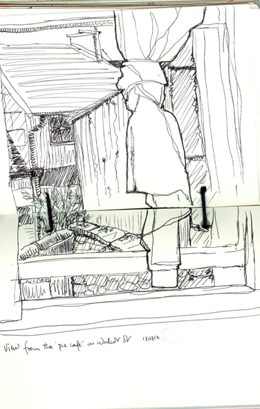
We had a lot of kindness shown to us in Bath; we received sponsorship from the local wine merchants and the furniture hire firm and because the gallery, an old mortuary chapel, doesn’t have a toilet, the staff at the ‘Made By Ben‘ pie cafe down the road let us use their facilities. Most welcome. And their home made pies are gorgeous too. Husb and I had a few hours doing the tourist bit on Friday and stopped off at the pie cafe for a spot of brunch. I did this drawing from the window at the back of the snug little tearoom into my A6 recycled, leather-bound sketchbook.
Rain, Reflections And RSI
I was ‘babysitting’ our ‘Commensalis‘ exhibition in Bath on Thursday, sitting opposite one of the old chapel windows and looking at my reflection against the torrential rain outside. During the quieter moments I sketched what I could see. It wasn’t easy because the layers that you see in a reflection are all squashed together. Does that make any sense? It isn’t the same as looking out across the real view. The depth of field is different, so I had to come up with lots of different marks to differentiate between the different layers of what I could see and to try and make sense of the drawing. One of the nice things about being an artist is that you stop and look for much longer than most people and the more you look, the more you see. I like the way the reflections merge into each other and some bits disappear and give way to others. This is drawn with a Pilot V5 hi-tecpoint 0.5 pen into my recycled A6 leatherbound sketchbook.
I haven’t had much time on the computer because of the exhibition and my RSI has improved a lot, but it’s still there, niggling away so I’m going to have to be a bit careful for a while. I’d rather do less on Twitter and Facebook than do less drawing and art.
The exhibition runs until 4pm on Sunday and there’s storytelling from Amanda Rackstraw during the afternoon. If you’re in the area, please do call in 🙂
Friday The 13th!
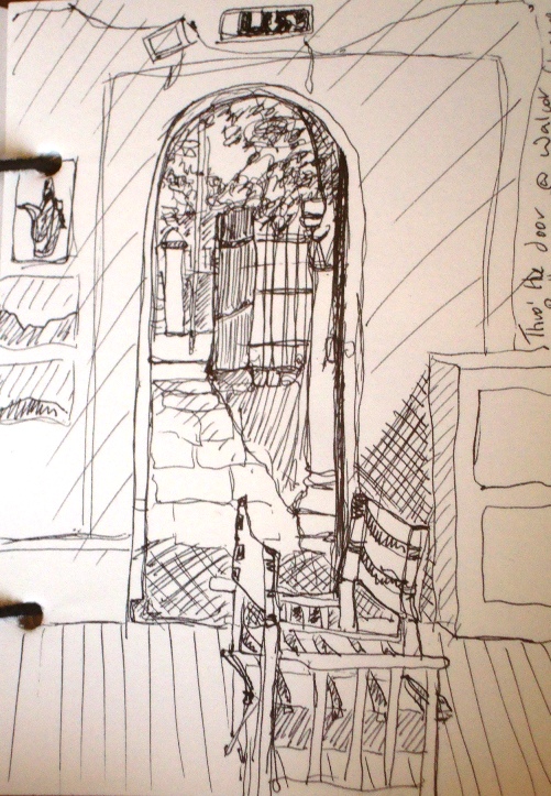
I’m up in Bath and it’s a lovely morning, sun shining and birds singing. Poured down yesterday when I was invigilating our exhibition, Commensalis at Walcot Chapel, but I guess that encouraged people to come into the dry. I did this drawing from the inside looking out. Drawing architecture is challenging because I don’t want it to look like an architect’s drawing so, like with drawing plants, I have to develop a shorthand of marks and a distinctive style. When I was a kid and tried drawing in my own style, some teachers and older relatives used to tell me off because I wasn’t drawing ‘properly’, which meant drawing as copying, using academic techniques.
The Walcot Chapel is an early eighteenth century mortuary chapel in one of the older parts of Bath. In the past, many sick people came to the city to take the waters at the spa. Some didn’t make it and died here. Walcot was one of the mortuary chapels where they were laid out and buried. The small steeply sloping grounds are crammed with old, worn gravestones and tombs. I’m doing an artist-in-conversation here this evening at 6.30 – it’s Friday 13th. That’s going to be a bit spooky!
But before all that, Husb and I are having a day out in Bath with a nice brunch and a visit to the amazing Baths. We found this excellent guide book yesterday – it’s fascinating and also very witty so we’ll let it guide us round the city today. The author has the marvellous name of Gideon Kibblewhite.
Sun, Stars And Short Sightedness
It’s SUNNY!!!! The deluge of biblical proportions has stopped for a couple of days. It isn’t warm, but the sun is shining. So Husb and I went for a walk on the beach yesterday and finally went for a coffee at the top of ‘The Tower‘; we’d been promising ourselves for ages. It’s a fairly new building on Swansea Marina and is the tallest building in Wales. It’s right on the edge of the beach and the views across the sea and over the city are incredible. And the coffee was pretty good too.
I scribbled the view along the beach to the East, taking in the Swansea Observatory. This is also a fairly recent building, built in 1989 and previously on loan to the local astronomical society. Unfortunately, about 3 years ago, the local council demanded a rent increase that the society couldn’t afford, so they moved out and it’s been empty ever since. The council were trying to sell it off, but I don’t know if there have been any buyers. It’s very short-sighted in my opinion to turf community groups out of subsidised buildings and sell them off for short-term gain – if they can be sold at all, especially in a recession. Wouldn’t it have been better to let community groups keep these places open? The city is full of empty premises falling into disrepair and the previous council seemed determined to add to the problem. Let’s hope the new, recently-elected council have a more proactive policy towards buildings, community groups and culture in the city. Fingers crossed.
