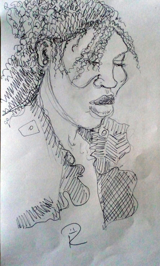
Entertaining blog from Thom Hickey exploring the life of songs. This one is fascinating, starting out in Texas in the 1950s and following its journey to London in the 1970s. With a great soundtrack. https://wp.me/p4pE0N-1I5
Cleaning Up

Cleaning Up. I’ve been doing some experimental printmaking onto some donated vintage paper the past few days, inspired by the random creative exercises of The Surrealists in the early 20th century. When I was cleaning up after the first day, where I used yellow ink (Caligo Safewash), I rolled my roller onto a large piece of paper to get the excess ink off. The next day, when I used red ink, I ripped a few strips of newspaper and put them onto the paper before I rolled the excess ink onto it. And finally, I did the same when I was cleaning the blue roller.

I really like it. I get my roller clean enough to wash AND I have some nice paper to work on. I think I’ll draw onto it with something dark, maybe black conté crayon or black oil bar, or maybe I’ll scan it into my Samsung Galaxy Tablet first and experiment before committing myself to paper.
Waste Not, Want Not.

After printing up all nine of my little brutalised randomised vinyl blocks yesterday in the final, blue, colour, I used up the ink that was left on a large sheet of Mylar, or Mark Resist, film. I’d already printed up the yellow and red leftover inks.

Waste Not, Want Not eh? I’ve no idea what I’m going to do with it, maybe collage?
Surrealists, Semiotics and Fifties Frock Fabric

I finally finished the random lino project I began a couple of weeks ago. I printed the final colour, Process Blue, today, using Caligo Safewash mixed with Extender in a 30:70 ratio. These were overprinted on two previous layers, Process Yellow and Process Magenta and I like the range of colours formed by the translucency of the inks. The purpose was to break through a creative block I’ve been wallowing in for the past couple of months and to take a chance with some randomness, following the example of the 20th century Surrealists, who often generated their ideas and concepts from creative exercises.
Has it worked? Well, I was hoping for something dark and insightful and what I have ended up with looks like 1950s frock fabric, but the process has certainly loosened up my approach to block (lino, wood) cut printing and germinated some ideas about developing my own semiotic imagery. Ooooh get me! This has taken me a long way to solving a particular problem I was having with one of my art projects, which was completely unexpected. RESULT!!!! 😀
This is an interesting blog that uses seasonal wild plants in delicious recipes and also gives a lotvof ghe mythological background as well. https://gathervictoria.com/2018/04/20/spellbinding-sweet-woodruff-cake-prosperity-magic/
Ripped From The Darkness

Our local art gallery, The Glynn Vivian, is showing a fabulous exhibition of drawings and prints by the formidable German artist Käthe Kollwitz. I have admired her work and life for so many years, I’m beside myself to see this exhibition so close to home. I like to study artists I admire and copy from the great mistresses and masters. This is a digital study I made today from her woodcut “The Widow” from the early 1920s. She is very sparing with the cutting tool, there are surprisingly few cuts which I think increases its impact, the sense that the image has been ripped from the surrounding darkness. I didn’t finish it, there’s another hand in the original. I can never resist a good book and I bought the exhibition book as a birthday present to myself, it’s “Portrait Of The Artist: Käthe Kollwitz” by Frances Carey and Max Egremont, published by The British Museum and IKON.
I drew this with a, now ancient, Samsung Galaxy Note 8 tablet using a free app called Markers. I laid a black ground down and drew with white lines.
Doug Sahm, Garland Jeffreys, ? and the Mysterians : 96 Tears
This is a really cool music blog that I follow, some groovy music on there today…. https://wp.me/p4pE0N-1G1
Talk Turned Geeky

Husb and I had a teatime visit from friends today and, as one of them is a fellow printmaker, the talk turned geeky. She noticed a number of my blockprinted portrait heads on the wall and we chatted about materials and techniques. Instead of the traditional lino or wood, or even modern vinyl, I used signwriters PVC foam sheet called Foamex. Lots of signwriters around here use it and chuck away the offcuts so it’s easy to get hold of them for free and recycle it.

It’s not easy to cut with conventional tools, it works better if you incise the surface. I used screwdrivers, chisels, ballpoint pen and a four-inch screw which I used to incise lines against a steel rule. Then I cut around the edge with a junior hacksaw and printed it up with black litho/relief oil-based ink onto Zercoll 145gsm paper using the Colombian Press at Swansea Print Workshop.
If you want to see more of these portrait heads, which I based on drawings I made during my first visit to Pakistan, please click here.
The Same Thing Every Year!

It’s the same every year on our allotment (community garden). Husb and I resolve to do the correct thing and work on it for an hour, then two, then three and so on, building up the muscles that have atrophied over the deluge that passes for the British winter. Unfortunately, the deluge keeps on happening in this little corner of Wales and so whenever there’s a rare glimmer of sunshine, we rush down to the allotment and work for as long and as hard as we can to keep on top of the couch grass and weeds that thrive in our temperate wet climate. Yesterday was one of those days. We went down in the morning to do a “couple of hours” but ended up working through nearly seven hours of hard labour. It felt great at the time but today….!!!! I’d be on my knees if I could bend down, which I can’t.

This afternoon was the launch of a group exhibition that I have some work in, at The Welfare in Ystradgynlais. Here I am with “Herstory”, the collaborative piece I did for International Women’s Day with graffiti artist Unity. I think I’m making a good job of disguising the fact that every muscle in my body (so it seems) has seized up! Oh, and it poured with rain. Again.
The Difference Of Materials
The difference of materials. I was engrossed in drawing at Galerie Simpson on Swansea’s High Street a couple of days ago. I’d taken a few sheets of very different papers and lots of drawing materials and I settled down to draw a fascinating clay sculpture by Tomos Sparnon which is in the current exhibition.

The first drawing I did in white, sanguine and black conté crayons onto a piece of smooth heavyweight cartridge paper that I had prepared with a coat of white acrylic gesso and then when it was dry I sponged it all over with my sepia home-made walnut ink. After drawing in conté crayons, I filled the area around the drawing with a square ended brush dipped in the walnut ink. I love the way the ink flows over gessoed paper and how it holds the brushstrokes. It’s a delicious ink to use, like liquid silk.
Then I moved my chair to take in a different angle and drew, again with the white, sanguine and black conté crayons onto a sheet of heavily textured grey Khadi paper. The result is completely different. I know I’m stating the blatantly obvious, but I was surprised at the extent of the differences. You can just see Tomos’ sculpture in the background.